Internal
ForegroundLinearLayout
分割线性能优化
接触第一个类就是他了,瞬间get到一点关于性能优化的,LinearLayout的divider相关属性,平时开发需要分割线个人表示很多情况下都是下面这样操作的
 <View
     android:layout_width="match_parent"
     android:layout_height="1dp"
     android:background="#ffffff"
     />
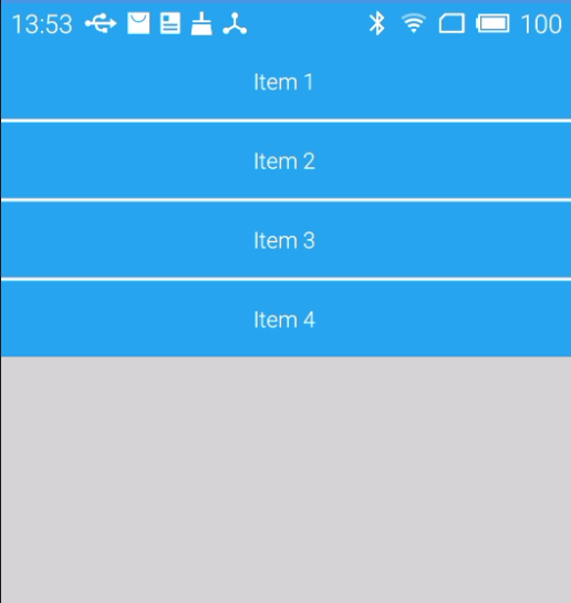
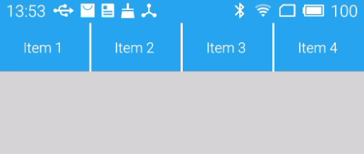
以上方案对性能上是有影响的,最优解决方案利用divider属性和Layout的showDividers,xml设置了shape类型的divider,showDividers控制显示分割线,这里必须的提一点关于size的设定,Layout方向水平和垂直定义shape的size是不同的
<?xml version="1.0" encoding="utf-8"?>
<shape xmlns:android="http://schemas.android.com/apk/res/android">
<solid android:color="#ffffff" />
<size android:width="2dp"/>
</shape>
showDividers属性可选值相关含义如下:
android:showDividers = "middle|end|beginning|none"

middle 在每一项中间添加分割线

end 在最后一项添加分割线

beginning 在最上方添加分割线

none 无
以上方法基于Android3.0+,向下兼容采用LinearLayoutCompat,下面是实现的相关效果图
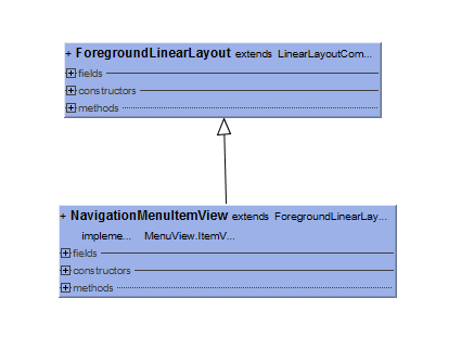
Foreground相关扩展控件
ForegroundLinearLayout 、ForegroundImageView、ForegroundRelativeLayout等相关的扩展控件,这类控件作用在你触摸控件显示前景色,实现原理相信随便找个扩展类查看源码你也能看懂,foreground属性配合TintMode使用会有意想不到的效果。下面推荐一片优质的blog关于Foreground的
http://blog.csdn.net/zhuoxiuwu/article/details/50976145
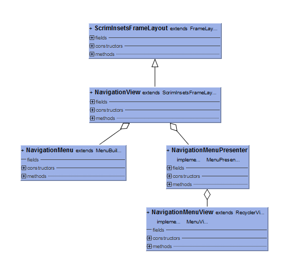
Navigation系列
Navigation系列本之前已经撸过了,再次看过源码相关,发现了本质RecyclerView,具体实现可以自行参考源码这里不过多解释,下面是相关的UML和曾经的学习链接相关的blog(NavigationMenuView extends RecyclerView)
http://blog.csdn.net/lmj623565791/article/details/46405409
http://www.cnblogs.com/JohnTsai/p/5172056.html
widget
Utils相关工具包
AnimationUtils
该类定义了几个静态的差之器,并提供方法计算插值以及一个动画监听器实现类
class AnimationUtils {

    static final Interpolator LINEAR_INTERPOLATOR = new LinearInterpolator();
    static final Interpolator FAST_OUT_SLOW_IN_INTERPOLATOR = new FastOutSlowInInterpolator();
    static final Interpolator FAST_OUT_LINEAR_IN_INTERPOLATOR = new FastOutLinearInInterpolator();
    static final Interpolator LINEAR_OUT_SLOW_IN_INTERPOLATOR = new LinearOutSlowInInterpolator();
    static final Interpolator DECELERATE_INTERPOLATOR = new DecelerateInterpolator();

 static int lerp()...

 static class AnimationListenerAdapter im...

}
DrawableUtils
每个 Drawable 都关联一个 ConstantState ,这是为了保存 Drawable 类对象的一些恒定不变的数据,如果从同一个 res 中创建的 Drawable 类对象,为了节约内存,它们会共享同一个 ConstantState 类对象。ConstantState可以动态设置,DrawableUtils提供兼容方案,在api 7和api 9采用了不同的方案处理,api9通过反射的方式调用方法而api7则采用反射调用变量赋值的方案。
class DrawableUtils {
private static Method sSetConstantStateMethod;
private static Field sDrawableContainerStateField;
private DrawableUtils() {}
static boolean setContainerConstantState(DrawableContainer drawable,
Drawable.ConstantState constantState) {
if (Build.VERSION.SDK_INT >= 9) {
return setContainerConstantStateV9(drawable, constantState);
} else {
return setContainerConstantStateV7(drawable, constantState);
}
}
private static boolean setContainerConstantStateV9(DrawableContainer drawable,
Drawable.ConstantState constantState) {
sSetConstantStateMethod = DrawableContainer.class.getDeclaredMethod(
"setConstantState", DrawableContainer.DrawableContainerState.class);
sSetConstantStateMethod.invoke(drawable, constantState);
}
private static boolean setContainerConstantStateV7(DrawableContainer drawable,
Drawable.ConstantState constantState) {
sDrawableContainerStateField.set(drawable, constantState);
}
}
ThemeUtils
使用design这个库就必须使用Theme.AppCompat theme相关主题,design的自定义控件会有主题的检测如果发现没有使用Theme.AppCompat 相关主题就会抛出异常。
class ThemeUtils {

    private static final int[] APPCOMPAT_CHECK_ATTRS = { R.attr.colorPrimary };

    static void checkAppCompatTheme(Context context) {
        TypedArray a = context.obtainStyledAttributes(APPCOMPAT_CHECK_ATTRS);
        final boolean failed = !a.hasValue(0);
        if (a != null) {
            a.recycle();
        }
        if (failed) {
            throw new IllegalArgumentException("You need to use a Theme.AppCompat theme "
                    + "(or descendant) with the design library.");
        }
    }
}
ViewUtils、ViewUtilsLollipop
这两个类主要是关于视图裁剪相关的代码封装,兼容不同的版本,高版本则需要视图裁剪,ViewUtilsLollipop调用默认的Rect裁剪,由于个人主观因素不想过多理解裁剪视图这块知识,这里仅提供学习链接:
http://www.open-open.com/lib/view/open1416664217867.html
MathUtils
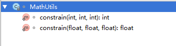
MathUtils仅提供两个方法都是用于限定值,传入值必须在有效范围内如果超出最大值或最小值就按照最大最小值取。比如在开发中根据滑动距离判断计算有效滑动范围等都会有用到。
class MathUtils {

    static int constrain(int amount, int low, int high) {
        return amount < low ? low : (amount > high ? high : amount);
    }

    static float constrain(float amount, float low, float high) {
        return amount < low ? low : (amount > high ? high : amount);
    }

}
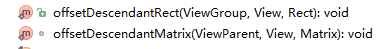
ViewGroupUtilsHoneycomb
这是一个关于ViewGroup相关类使用的,用于子View的偏移范围Matrix变换相关的,主要就两个方法
这里恶补个人基础知识点:
/**
 *src矩阵复制到这个矩阵。如果src是null,重置矩阵单位矩阵。
 **
 Matrix{
  public void set(Matrix src) {
        if (src == null) {
            reset();
        } else {
            native_set(native_instance, src.native_instance);
        }
    }
  }
ThreadLocal 资料 :
http://www.cnblogs.com/dolphin0520/p/3920407.html
http://justsee.iteye.com/blog/791919
Dialog扩展
弹出视图窗口有Dialog、AlertDialog、PopupWindow等,后来出了DialogFragment可以更好地管理生命周期,有了Design之后,他们也开始渐入开发者视线:
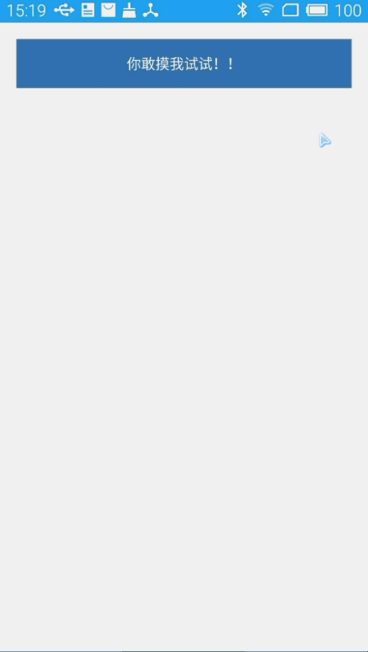
个人认为你只要有学习能力随便看看就可以玩转上面这三个类,so 用法实例就不贴,就贴一个BottomSheetDialog 的运行效果图吧(不要关注图的内容,看效果,注重内涵,我理解的touch就是摸一摸那么一回事儿)
BottomSheetDialog的核心在BottomSheetBehavior,这块涉及到的知识会在后面详细说明。这里就略过了。
Coordinator相关类
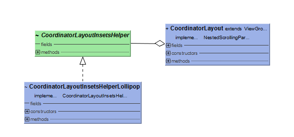
CoordinatorLayout相关源码理解请参考下面链接(个人只明白个大概,写不出什么,还是参考已有blog比较好)
Insets相关类以及它关联接口OnApplyWindowInsetsListener的相关理解,请参考下面链接
http://www.jianshu.com/p/aca4fd6743b1
在理解CoordinatorLayout源码时,你不得不了解的知识NestedScroll相关的,可以参考我以前的一篇blog关于这块的知识
http://blog.csdn.net/analyzesystem/article/details/51122653
当你了解了NestedScroll知识后需要先看Behavior的知识,下面提供个人认为写的比较清晰明了的一篇blog
http://blog.csdn.net/huachao1001/article/details/51554608
关于以上知识的一个实战小Case可以参考下面链接
http://www.jcodecraeer.com/a/anzhuokaifa/androidkaifa/2015/0818/3315.html
http://www.open-open.com/lib/view/open1437312265428.html
CoordinatorLayout还提供了setStatusBar相关方法,开发如果有需要可以直接调用。CoordinatorLayout涵盖的知识比较多,在后续会单独一篇blog再来实战CoordinatorLayout。
Behavior相关类(自定义Behavior可以参考学习)
BottomSheetBehavior、SwipeDismissBehavior、ViewOffsetBehavior、

HeaderScrollingViewBehavior、HeaderBehavior、ViewOffsetHelper
关于BottomSheetBehavior使用遇到的坑以及相关实现原理参考下面链接
http://www.jcodecraeer.com//a/anzhuokaifa/androidkaifa/2016/0228/4009.html
Snack相关
design库的SnackBar与我之前看过的开源库的SnackBar不同,以前那个是Dialog直接弹出,这这个SnackBar有用到Behavior相关知识,采用Handler通信控制View的动画效果。先看图
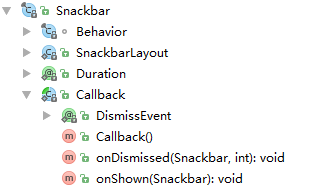
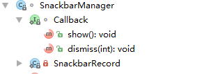
SnackBar的视图就是一个自定义的SnackBarLayout(只有两个控件TextView和Button),Duration注解的是时长,Behavior修改的onInterceptTouchEvent拦截,发消息处理hideView.
   static {
        sHandler = new Handler(Looper.getMainLooper(), new Handler.Callback() {
            @Override
            public boolean handleMessage(Message message) {
                switch (message.what) {
                    case MSG_SHOW:
                        ((Snackbar) message.obj).showView();
                        return true;
                    case MSG_DISMISS:
                        ((Snackbar) message.obj).hideView(message.arg1);
                        return true;
                }
                return false;
            }
        });
    }
动画控制的核心在这里
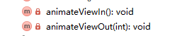
根据不同版本选择 ViewCompat.setTranslationY或loadAnimation Res下预定义好的动画。
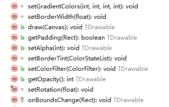
FloatingActionButtonImpl 相关类
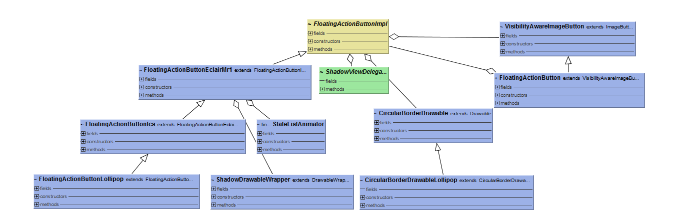
从上图可以看出,FloatingActionButtonImpl 类牵扯甚广,本人表示只用过FloatingActionButton
ShadowViewDelegate
阴影View视图代理接口定义
interface ShadowViewDelegate {
    float getRadius();
    void setShadowPadding(int left, int top, int right, int bottom);
    void setBackgroundDrawable(Drawable background);
    boolean isCompatPaddingEnabled();
}
CircularBorderDrawable、CircularBorderDrawableLollipop
小表瞌睡来了,就写得草一点了,上面两个类是关于圆形边框绘制的,通过画笔配置LinearGradient(shader),调用drawOval方法绘制。下面是一些方法(见名知其意)
VisibilityAwareImageButton、 FloatingActionButton
根据继承关系来看都是ImageButton,这里只需要关注核心类fab,先看构造函数了解我们布局能用到的自定义属性(检查Theme主题看到了吧)
public FloatingActionButton(Context context, AttributeSet attrs, int defStyleAttr) {
super(context, attrs, defStyleAttr)
ThemeUtils.checkAppCompatTheme(context)
TypedArray a = context.obtainStyledAttributes(attrs,
R.styleable.FloatingActionButton, defStyleAttr,
R.style.Widget_Design_FloatingActionButton)
mBackgroundTint = a.getColorStateList(R.styleable.FloatingActionButton_backgroundTint)
mBackgroundTintMode = parseTintMode(a.getInt(
R.styleable.FloatingActionButton_backgroundTintMode, -1), null)
mRippleColor = a.getColor(R.styleable.FloatingActionButton_rippleColor, 0)
mSize = a.getInt(R.styleable.FloatingActionButton_fabSize, SIZE_NORMAL)
mBorderWidth = a.getDimensionPixelSize(R.styleable.FloatingActionButton_borderWidth, 0)
final float elevation = a.getDimension(R.styleable.FloatingActionButton_elevation, 0f)
final float pressedTranslationZ = a.getDimension(
R.styleable.FloatingActionButton_pressedTranslationZ, 0f)
mCompatPadding = a.getBoolean(R.styleable.FloatingActionButton_useCompatPadding, false)
a.recycle()
mImageHelper = new AppCompatImageHelper(this, AppCompatDrawableManager.get())
mImageHelper.loadFromAttributes(attrs, defStyleAttr)
final int maxImageSize = (int) getResources().getDimension(R.dimen.design_fab_image_size)
mImagePadding = (getSizeDimension() - maxImageSize) / 2
getImpl().setBackgroundDrawable(mBackgroundTint, mBackgroundTintMode,
mRippleColor, mBorderWidth)
getImpl().setElevation(elevation)
getImpl().setPressedTranslationZ(pressedTranslationZ)
getImpl().updatePadding()
}
以上类容涉及到的自定义属性无需记忆,需要用是直接参考构造函数,代码调用直接参考类的set get方法即可。
在这个类很多地方都可以看到getImpl方法,这是一个根据版本选择不同的实现,阴影的绘制就在这里传入阴影绘制代理实现类。
  private FloatingActionButtonImpl createImpl() {
        final int sdk = Build.VERSION.SDK_INT;
        if (sdk >= 21) {
            return new FloatingActionButtonLollipop(this, new ShadowDelegateImpl());
        } else if (sdk >= 14) {
            return new FloatingActionButtonIcs(this, new ShadowDelegateImpl());
        } else {
            return new FloatingActionButtonEclairMr1(this, new ShadowDelegateImpl());
        }
    }
fab的visibility发生变化时会通过OnVisibilityChangedListener接口定义的show hide方法会调到具体的子类的show hide方法
    private void show(OnVisibilityChangedListener listener, boolean fromUser) {
        getImpl().show(wrapOnVisibilityChangedListener(listener), fromUser);
    }
show hide主要是缩放透明的变化,animation采用的方式不同而已。
一些关系不浅的自定义控件
AppBarLayout与CollapsingToolbarLayout
这里先不具体理解,同样待后续blog再来实战了解源码,这里仅提供blog学习链接几篇(个人在学一个开源的库 Android-ObservableScrollView可以实现这些类似效果,时间预估在学完这个开源库再来看design这方面源码,再加上前端和MPAndroidChart学习,估计这下篇得等一段时间了)
http://www.tuicool.com/articles/j2yAbqR
http://www.open-open.com/lib/view/open1445087021700.html
http://blog.csdn.net/feiduclear_up/article/details/46514791
http://www.ithao123.cn/content-10399248.html
http://www.open-open.com/lib/view/open1438265746378.html
TextInputLayout 和TextInputEditText使用
如果你没了解过可以参考下面链接(表示很久前写过一篇blog学过了,不想过度理解,个人感觉:这玩意在实际项目开发中用处不大,基本国内的app很少这样设计,我们了解就行了)
http://blog.csdn.net/u014733374/article/details/46878839
http://www.jianshu.com/p/0f6575472cb6
TabLayout
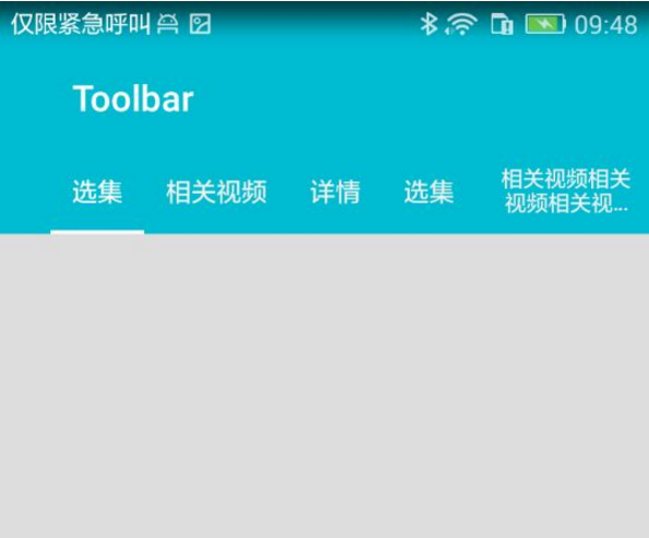
我们首先需要了解它的自定义控件的属性相关
tabIndicatorHeight
tabIndicatorColor
tabPadding
tabPaddingStart
tabPaddingTop
tabPaddingEnd
tabPaddingBottom
tabTextAppearance
tabTextColor
tabSelectedTextColor
tabMinWidth
tabMaxWidth
tabBackground
tabContentStart
tabGravity
tabMode
xml布局引入TabLayout(xmlns:design=”http://schemas.android.com/apk/res-auto”这句必不可少)
<?xml version="1.0" encoding="utf-8"?>
<LinearLayout xmlns:android="http://schemas.android.com/apk/res/android"
    xmlns:design="http://schemas.android.com/apk/res-auto"
    xmlns:tools="http://schemas.android.com/tools"
    android:layout_width="match_parent"
    android:layout_height="match_parent"
    android:background="#efefee"
    android:orientation="vertical"
    android:fitsSystemWindows="true"
    tools:context="idea.analyzesystem.ui.tablayout.MainActivity">

    <android.support.design.widget.TabLayout
        android:id="@+id/tabLayout_first"
        android:layout_width="match_parent"
        android:layout_height="wrap_content"
        design:tabIndicatorHeight="2dp"
        design:tabIndicatorColor="#fff"
        android:background="@color/colorPrimary"
        design:tabPadding="5dp"
        design:tabMinWidth="40dp"
        design:tabMaxWidth="100dp"
        design:tabGravity="fill"
        design:tabSelectedTextColor="#ffffff"
        design:tabTextColor="#f1f1f1"
        design:tabMode="scrollable"
        design:tabContentStart="40dp"
        />

    <View
        android:layout_width="match_parent"
        android:layout_height="match_parent"
        android:background="#DDDDDD"/>
</LinearLayout>
代码中初始化TabLayout布局,默认选中第一个Tab
 protected void initialTabLayout() {
        for (int i = 0; i < tabValues.length; i++) {
            mTabLayout.addTab(mTabLayout.newTab().setText(tabValues[i]), i == 0 ? true : false);
        }
    }
当然,添加tab的方式还可以用xml布局引用
   //**********************此处略************************
       <android.support.design.widget.TabItem
            android:layout_width="wrap_content"
            android:layout_height="wrap_content"
            android:text="首页"
            android:icon="@null"
            />
        <android.support.design.widget.TabItem
            android:layout_width="wrap_content"
            android:layout_height="wrap_content"
            android:text="首页"
            android:icon="@null"
            />
        </android.support.design.widget.TabLayout>
根据源码内部链接,可以到http://www.google.com/design/spec/components/tabs.html#tabs-usage这里去了解TabLayout相关效果和开发注意事项,这里略过。tablLayout内部隐藏方法注解Mode,对应值与自定义属性tabMode相对应,默认固定模式,当我们需要动态改变调用setTabMode(int mode)
  public void setTabMode(@Mode int mode) {
        if (mode != mMode) {
            mMode = mode;
            applyModeAndGravity();
        }
    }
如果需要与ViewPager连动调用下面这个方法就可以了
public void setupWithViewPager(@Nullable final ViewPager viewPager) {}
需要修改选中tab下面的指示器颜色调用
public void setSelectedTabIndicatorColor(@ColorInt int color) {
        mTabStrip.setSelectedIndicatorColor(color);
    }
在这之前也写过类似TabLayout控件的开源库分析:FlycoTabLayout、 PagerSlidingTabStrip
小结
多看源码总会有些许的意外收获,当然也许你会说“我看不懂”,我只能告诉你不要太在意细节,不必一字一句去读懂,了解源码的大致工作流程,学习源代码编码风格和代码设计,这将对自己是一个提升捷径。
最近要忙了,MPAndroidChart开源库的源码理解实战目前进度缓慢,前端学习进度缓慢,本篇的续篇待产,草稿箱的半成品堆积..
小逗逼在这里说一件重要事:周末所有私信都不回复啊,周末休息不谈码,对于某某些人还请见谅!!
本文内容由网友自发贡献,版权归原作者所有,本站不承担相应法律责任。如您发现有涉嫌抄袭侵权的内容,请联系:hwhale#tublm.com(使用前将#替换为@)