是否可以创建角形的 css 丝带?
 .
.
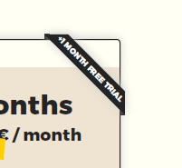
我尝试过使用 png 图像,但是是否有任何选项可以使用 css 创建?也应该与响应式视图一起使用。
.container {
  width: 200px;
  height: 200px;
  position: relative;
  margin: 20px;
  overflow: hidden;
}

.box {
  width: 100%;
  height: 100%;
  position: absolute;
  top: 0;
  left: 0;
  opacity: 0.8; /* for demo purpose  */
}

.stack-top {
  height: 30px;
  z-index: 9;
  margin: 40px; /* for demo purpose  */
  transform: rotateY(0deg) rotate(45deg); /* needs Y at 0 deg to behave properly*/
  transition: transform 2s;
  color: #fff;
}
<div class="container">
<div class="box" style="background: #fffff3;"></div>
<div class="box stack-top" style="background: #242424;"> 1Month</div>
</div>
您可以尝试如下所示:
.container {
  width: 200px;
  height: 150px;
  position: relative;
  display:inline-block;
  margin: 10px;
  background: lightblue;
}

.stack-top {
  /* adjust the below to control the shape */
  --d:5px;
  --g:16px;
  --c:#333;
  /**/

  position: absolute;
  top: 0;
  right: 0;
  transform: translate(29.29%, -100%) rotate(45deg); /* 29.29% = 100%*(1 - cos(45deg)) */
  color: #fff;
  text-align: center;
  width: 100px;
  transform-origin: bottom left;
  padding:5px 0 calc(var(--d) + 5px);
  background:
    linear-gradient(135deg, transparent var(--g), var(--c) calc(var(--g) - 0.3px)) left,
    linear-gradient(-135deg,transparent var(--g), var(--c) calc(var(--g) - 0.3px)) right;
  background-size:51% 100%;
  background-repeat:no-repeat;
  clip-path:polygon(0 0,100% 0,100% 100%, calc(100% - var(--d)) calc(100% - var(--d)), var(--d) calc(100% - var(--d)),0 100%)
}
<div class="container">
  <div class="stack-top">1Month</div>
</div>

<div class="container">
  <div class="stack-top" style="--d:0px;--g:19px;width:120px;--c:blue">1Month</div>
</div>

<div class="container">
  <div class="stack-top" style="--d:8px;--g:17px;width:80px;--c:red">XX</div>
</div>

<div class="container">
  <div class="stack-top" style="--d:10px;--g:20px;width:200px;--c:green">1Month</div>
</div>
另一项调整是为折叠部分添加阴影效果:
.container {
  width: 200px;
  height: 150px;
  position: relative;
  display:inline-block;
  margin: 10px;
  background: lightblue;
}

.stack-top {
  /* adjust the below to control the shape */
  --d:5px;
  --w:100px;
  --c:#333;
  /**/

  position: absolute;
  top: 0;
  right: 0;
  transform: translate(29.29%, -100%) rotate(45deg); /* 29.29% = 100%*(1 - cos(45deg)) */
  color: #fff;
  text-align: center;
  width: var(--w);
  transform-origin: bottom left;
  padding:5px 0 calc(var(--d) + 5px);
  background:
    linear-gradient(rgba(0,0,0,0.6) 0 0) bottom/100% var(--d) no-repeat
    var(--c);
  clip-path:polygon(0 100%,0 calc(100% - var(--d)),50% calc(100% - var(--d) - var(--w)/2),100% calc(100% - var(--d)),100% 100%,calc(100% - var(--d)) calc(100% - var(--d)), var(--d) calc(100% - var(--d)))
}
<div class="container">
  <div class="stack-top">1Month</div>
</div>

<div class="container">
  <div class="stack-top" style="--d:0px;--w:120px;--c:pink">1Month</div>
</div>

<div class="container">
  <div class="stack-top" style="--d:8px;--w:80px;--c:red">XX</div>
</div>

<div class="container">
  <div class="stack-top" style="--d:12px;--w:200px;--c:green">1Month</div>
</div>
您可以添加位置选项:
.container {
  width: 200px;
  height: 150px;
  position: relative;
  display:inline-block;
  margin: 10px;
  background: lightblue;
}

.stack-top {
  /* adjust the below to control the shape */
  --d:5px;
  --w:100px;
  --c:#333;
  /**/

  position: absolute;
  top: 0;
  right: 0;
  transform: translate(29.29%, -100%) rotate(45deg); /* 29.29% = 100%*(1 - cos(45deg)) */
  color: #fff;
  text-align: center;
  width: var(--w);
  transform-origin: bottom left;
  padding:5px 0 calc(var(--d) + 5px);
  background:
    linear-gradient(rgba(0,0,0,0.6) 0 0) bottom/100% var(--d) no-repeat
    var(--c);
  clip-path:polygon(0 100%,0 calc(100% - var(--d)),50% calc(100% - var(--d) - var(--w)/2),100% calc(100% - var(--d)),100% 100%,calc(100% - var(--d)) calc(100% - var(--d)), var(--d) calc(100% - var(--d)))
}

.stack-top.left {
  left:0;
  right:auto;
  transform: translate(-29.29%, -100%) rotate(-45deg);
  transform-origin: bottom right;
}
<div class="container">
  <div class="stack-top">1Month</div>
</div>

<div class="container">
  <div class="stack-top" style="--d:0px;--w:120px;--c:pink">1Month</div>
</div>

<div class="container">
  <div class="stack-top left" style="--d:8px;--w:80px;--c:red">XX</div>
</div>

<div class="container">
  <div class="stack-top left" style="--d:12px;--w:200px;--c:green">1Month</div>
</div>
本文内容由网友自发贡献,版权归原作者所有,本站不承担相应法律责任。如您发现有涉嫌抄袭侵权的内容,请联系:hwhale#tublm.com(使用前将#替换为@)