我试图使所有一行 4 个图像都具有相同的高度尺寸,我已经尝试使用 css 来调整宽度和高度,但似乎没有任何效果,纵向图像最终总是比横向图像高,这是代码:
<div class="container" >
<div class="jumbotron" style="background: rgba(200, 54, 54, 0.0);">
<div class="row">
<div class="col-lg-3 col-md-6 col-sm-12 col-xs-12">
<a href="#"><img class="left-block img-responsive" src="images/genimage.png" width="160" height="160" alt="" /></a>
<p style="width: 200px; overflow: hidden; white-space: nowrap; text-overflow: ellipsis; ">One Random Item</p>
<p>50 €</p>
</div>
<div class="col-lg-3 col-md-6 col-sm-12 col-xs-12">
<a href="#"><img class="left-block img-responsive" src="images/genimage.png" width="160" height="160" alt="" /></a>
<p style="width: 200px; overflow: hidden; white-space: nowrap; text-overflow: ellipsis; ">Another Random Item</p>
<p>50 €</p>
</div>
<div class="col-lg-3 col-md-6 col-sm-12 col-xs-12">
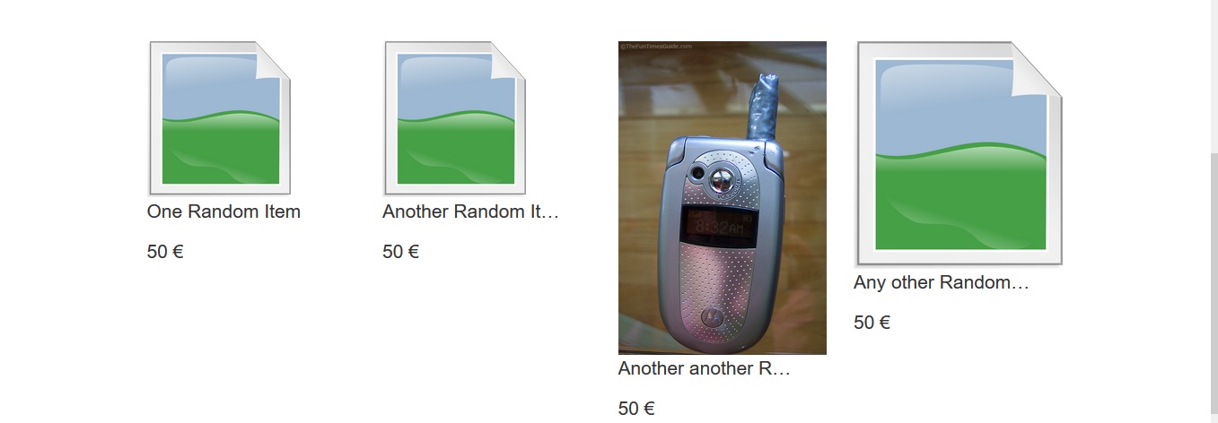
<a href="#"><img class="left-block img-responsive" src="images/genimage2.jpg" height="160" width="160" alt="" /></a>
<p style="width: 200px; overflow: hidden; white-space: nowrap; text-overflow: ellipsis; ">Another another Random Item</p>
<p>50 €</p>
</div>
<div class="col-lg-3 col-md-6 col-sm-12 col-xs-12">
<a href="#"><img class="left-block img-responsive" src="images/genimage.png" width="160" height="160" alt="" /></a>
<p style="width: 200px; overflow: hidden; white-space: nowrap; text-overflow: ellipsis; ">Any other Random Item Any other Random Item </p>
<p>50 €</p>
</div>
</div>
发生的情况是这样的:
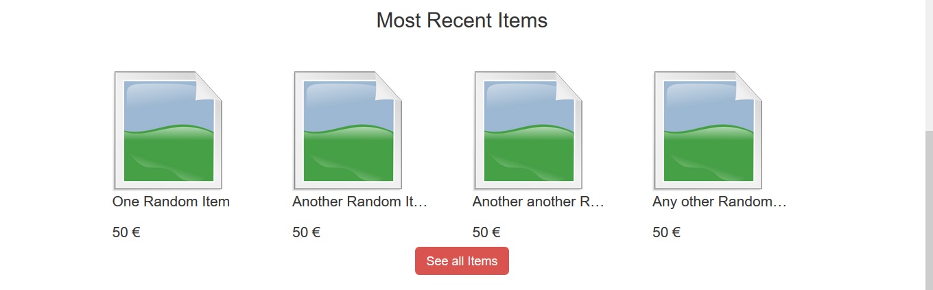
这就是我想要的(都具有相同的高度)
您可以去掉 HTML 中的宽度/高度属性并使用 CSS 来完成此操作。只需明确设置你的高度和你的宽度auto。例如:
.img-responsive {
    width: auto;
    height: 100px;
}
您需要小心地在水平方向上留出足够的空间,因为一旦缩放这些图像,您将不知道它们的确切宽度。
本文内容由网友自发贡献,版权归原作者所有,本站不承担相应法律责任。如您发现有涉嫌抄袭侵权的内容,请联系:hwhale#tublm.com(使用前将#替换为@)