优先级的介绍:
特性:不同选择器具有不同的优先级,优先级高的选择器样式会覆盖优先级低选择器样式
优先级公式: 继承 < 通配符选择器 < 标签选择器 < 类选择器 < id选择器 < 行内样式 < !important
注意点:
1. !important写在属性值的后面,分号的前面!
2. !important不能提升继承的优先级,只要是继承优先级最低!
3. 实际开发中不建议使用 !important 。
<!DOCTYPE html>
<html lang="en">
<head>
    <meta charset="UTF-8">
    <meta name="viewport" content="width=device-width, initial-scale=1.0">
    <title>Document</title>
      <style>
        #box {
            color: orange;
        }

        .box {
            color: blue;
        }

        div {
            color: green !important;
        }

        body {
            color: red;
        }

        /* !important不要给继承的添加, 自己有样式无法继承父级样式 */
    </style>
</head>
<body>
    <!-- 意义: 当一个标签使用了多个选择器, 样式冲突的时候, 到底谁生效 -->
    <div class="box" id="box" style="color: pink;">测试优先级</div>
</body>
</html>
权重叠加计算:
场景:如果是复合选择器,此时需要通过权重叠加计算方法,判断最终哪个选择器优先级最高会生效
➢ 权重叠加计算公式:(每一级之间不存在进位)
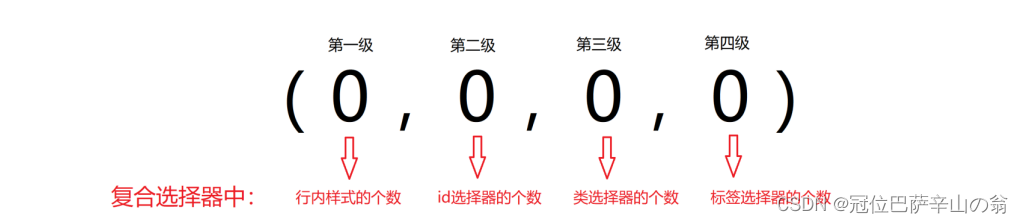
比较规则:
1. 先比较第一级数字,如果比较出来了,之后的统统不看
2. 如果第一级数字相同,此时再去比较第二级数字,如果比较出来了,之后的统统不看
3. ……
4. 如果最终所有数字都相同,表示优先级相同,则比较层叠性(谁写在下面,谁说了算!)
5.注意点:!important如果不是继承,则权重最高,天下第一!
6.实际开发中选择标签需要精准,尽量避免多个选择器同时选中一个标签的情况,不要自己难为自己
<!DOCTYPE html>
<html lang="en">
<head>
  <meta charset="UTF-8">
  <meta name="viewport" content="width=device-width, initial-scale=1.0">
  <title>Document</title>
  <style>
    /* #one {
      color: red;
    }

    .son {
      color: blue;
    }

    p {
      color: green;
    } */

    /* (行内, id, 类, 标签) */

    /* (0, 1, 0, 1) */
     div #one {
      color: orange;
    }

    /* (0, 0, 2, 0) */
    .father .son {
      color: skyblue;
    }

    /* 0, 0, 1, 1 */
    .father p {
      color: purple;
    }

    /* 0, 0, 0, 2 */
    div p {
      color: pink;
    }

  </style>
</head>
<body>
  <div class="father">
    <p class="son" id="one">我是一个标签</p>
  </div>
</body>
</html>

前面不会没关系,盒子模型必须会。不然这几天白学了。

CSS 中规定每个盒子分别由:内容区域(content)、内边距区域(padding)、边框区域(border)、外边距区域( margin)构成,这就是 盒子模型
<!DOCTYPE html>
<html lang="en">
<head>
    <meta charset="UTF-8">
    <meta http-equiv="X-UA-Compatible" content="IE=edge">
    <meta name="viewport" content="width=device-width, initial-scale=1.0">
    <title>Document</title>
    <style>
        /* 纸箱子, 填充泡沫 */
        div {
            width: 300px;
            height: 300px;
            background-color: pink;
            /* 边框线 == 纸箱子 */
            border: 1px solid #000;
            /* 内边距 == 填充泡沫 : 出现在内容和盒子边缘之间 */
            padding: 20px;

            /* 外边距 : 出现在两个盒子之间, 出现在盒子的外面*/
            margin: 50px;
        }
    </style>
</head>
<body>
    <div>内容电脑</div>
    <div>内容电脑</div>
</body>
</html>

<!DOCTYPE html>
<html lang="en">
<head>
    <meta charset="UTF-8">
    <meta http-equiv="X-UA-Compatible" content="IE=edge">
    <meta name="viewport" content="width=device-width, initial-scale=1.0">
    <title>Document</title>
    <style>
        div {
            width: 200px;
            height: 200px;
            background-color: pink;
            /* border: 粗细  线条样式   颜色 -- 不分先后顺序 */
            /* solid : 实线 */
            /* border: 1px solid #000; */

            /* dashed: 虚线 */
            /* border: 5px dashed #000; */

            /* dotted : 点线 */
            /* border: 5px dotted #000; */

            border-left: 5px dotted #000;
            border-right: 5px dotted #000;
            border-top: 1px solid red;
            border-bottom: 1px solid red;
        }
    </style>
</head>
<body>
    <div>内容</div>
</body>
</html>

<!DOCTYPE html>
<html lang="en">
<head>
    <meta charset="UTF-8">
    <meta http-equiv="X-UA-Compatible" content="IE=edge">
    <meta name="viewport" content="width=device-width, initial-scale=1.0">
    <title>Document</title>
    <style>
        div {
            width: 300px;
            height: 300px;
            background-color: pink;
            /* 添加了4个方向的内边距 */
            /* padding: 50px; */

            /* padding 属性可以当做复合属性使用, 表示单独设置某个方向的内边距 */
            /* padding 最多取4个值 */

            /* 四值: 上  右   下  左 */
            /* padding: 10px 20px 40px 80px; */

            /* 三值 : 上   左右   下*/
            /* padding: 10px 40px 80px; */

            /* 两值 : 上下  左右*/
            /* padding: 10px 80px; */

            padding-left: 10px;
            padding-bottom: 50px;
        }

        /* 多值写法, 永远都是从上开始顺时针转一圈, 如果数不够, 看对面 */
    </style>
</head>
<body>
    <div>文字</div>
</body>
</html>

<!DOCTYPE html>
<html lang="en">
<head>
    <meta charset="UTF-8">
    <meta http-equiv="X-UA-Compatible" content="IE=edge">
    <meta name="viewport" content="width=device-width, initial-scale=1.0">
    <title>Document</title>
    <style>
        div {
            /* 撑大盒子的都有啥? border + padding */
            width: 240px;
            height: 240px;
            background-color: pink;
            border: 10px solid #000;
            padding: 20px;
        }
    </style>
</head>
<body>
    <div>文字</div>
</body>
</html>

<!DOCTYPE html>
<html lang="en">
<head>
    <meta charset="UTF-8">
    <meta http-equiv="X-UA-Compatible" content="IE=edge">
    <meta name="viewport" content="width=device-width, initial-scale=1.0">
    <title>Document</title>
    <style>
        div {
            width: 100px;
            height: 100px;
            background-color: pink;
            border: 10px solid #000;
            padding: 20px;

            /* 內减模式 */
            /* 变成CSS3的盒子模型, 好处: 加了border和padding不需要手动减法 */
            box-sizing: border-box;
        }
    </style>
</head>
<body>
    <div>文字</div>
</body>
</html>
<!DOCTYPE html>
<html lang="en">
<head>
    <meta charset="UTF-8">
    <meta http-equiv="X-UA-Compatible" content="IE=edge">
    <meta name="viewport" content="width=device-width, initial-scale=1.0">
    <title>Document</title>
    <style>
        * {
            margin: 0;
            padding: 0;
        }
    </style>
</head>
<body>
    <p>pppp</p>
    <p>pppp</p>
    <h1>h1</h1>
    <ul>
        <li>lili</li>
    </ul>
</body>
</html>
<!DOCTYPE html>
<html lang="en">
<head>
    <meta charset="UTF-8">
    <meta http-equiv="X-UA-Compatible" content="IE=edge">
    <meta name="viewport" content="width=device-width, initial-scale=1.0">
    <title>Document</title>
    <style>
        div {
            width: 1000px;
            height: 300px;
            background-color: pink;
            margin: 0 auto;
        }
    </style>
</head>
<body>
    <!-- 版心: 网页的有效内容 -->
    <!-- 版心居中 -->
    <div>版心</div>
</body>
</html>

<!DOCTYPE html>
<html lang="en">
<head>
<meta charset="UTF-8">
<meta http-equiv="X-UA-Compatible" content="IE=edge">
<meta name="viewport" content="width=device-width, initial-scale=1.0">
<title>Document</title>
<style>
* {
margin: 0;
padding: 0;
/* 所有的标签都可能添加内边距或border, 都內减模式 */
box-sizing: border-box;
}
.news {
width: 500px;
height: 400px;
border: 1px solid #ccc;
margin: 50px auto;
padding: 42px 30px 0;
}
.news h2 {
border-bottom: 1px solid #ccc;
font-size: 30px;
/* 行高是1倍, 就是字号的大小 */
line-height: 1;
padding-bottom: 9px;
}
/* 去掉列表的符号 */
ul {
list-style: none;
}
/* li {} */
.news li {
height: 50px;
border-bottom: 1px dashed #ccc;
padding-left: 28px;
line-height: 50px;
}
.news a {
text-decoration: none;
color: #666;
font-size: 18px;
}
</style>
</head>
<body>
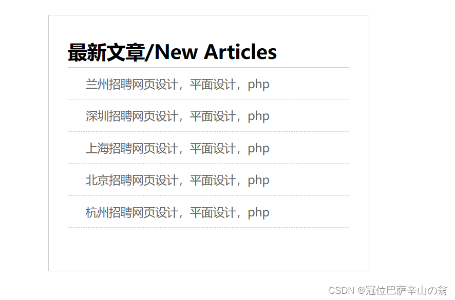
<!-- 从外到内 -->
<div class="news">
<h2>最新文章/New Articles</h2>
<ul>
<li><a href="#">兰州招聘网页设计,平面设计,php</a></li>
<li><a href="#">深圳招聘网页设计,平面设计,php</a></li>
<li><a href="#">上海招聘网页设计,平面设计,php</a></li>
<li><a href="#">北京招聘网页设计,平面设计,php</a></li>
<li><a href="#">杭州招聘网页设计,平面设计,php</a></li>
</ul>
</div>
</body>
</html>
<!DOCTYPE html>
<html lang="en">
<head>
    <meta charset="UTF-8">
    <meta http-equiv="X-UA-Compatible" content="IE=edge">
    <meta name="viewport" content="width=device-width, initial-scale=1.0">
    <title>Document</title>
    <style>
        div {
            width: 100px;
            height: 100px;
            background-color: pink;
        }

        .one {
            /* margin-bottom: 50px; */
            margin-bottom: 60px;
        }

        .two {
            margin-top: 50px;
        }
    </style>
</head>
<body>
    <div class="one">11</div>
    <div class="two">22</div>
</body>
</html>
<!DOCTYPE html>
<html lang="en">
<head>
    <meta charset="UTF-8">
    <meta http-equiv="X-UA-Compatible" content="IE=edge">
    <meta name="viewport" content="width=device-width, initial-scale=1.0">
    <title>Document</title>
    <style>
        .father {
            width: 300px;
            height: 300px;
            background-color: pink;
            /* padding-top: 50px; */
            /* 如果设计稿没有border, 不能使用这个解决办法 */
            /* border: 1px solid #000; */

            /* overflow: hidden; */
        }

        .son {
            width: 100px;
            height: 100px;
            background-color: skyblue;

            margin-top: 50px;

            display: inline-block;
        }
    </style>
</head>
<body>
    <div class="father">
        <div class="son">son</div>
    </div>
</body>
</html>
<!DOCTYPE html>
<html lang="en">
<head>
    <meta charset="UTF-8">
    <meta http-equiv="X-UA-Compatible" content="IE=edge">
    <meta name="viewport" content="width=device-width, initial-scale=1.0">
    <title>Document</title>
    <style>
        span {
            /* margin: 100px; */
            /* padding: 100px; */
            line-height: 100px;
        }
    </style>
</head>
<body>
    <!-- 行内元素   内外边距  margin  padding -->

    <!-- 如果想要通过margin或padding改变行内标签的垂直位置, 无法生效 -->
    <!-- 行内标签的margin-top和bottom 不生效 -->
    <!-- 行内标签的padding-top或botttom 不生效 -->
    <span>span</span>
    <span>span</span>
</body>
</html>