世界上总有一半人不理解另一半人的快乐。
——《爱玛》

目录
一、前言
二、本期作品介绍
3D旋转相册
三、效果展示
四、详细介绍
五、编码实现
index.html
style.css
img
六、获取源码
公众号获取源码
获取源码?私信?关注?点赞?收藏?
一、前言
新的一年,我们是是否需要一个新的相册呢?答案:是的。
2023年,已经过去了一个半月的时间,我们已经在2023年,经历了大大小小很多的事情,不知道那些事情值得你记忆呢?你是否还记得呢?
今天,为大家推荐的是一款好看的3D旋转相册,用来记录2023年的美好时刻,一个不算新颖但很有创意的作品,记录美好生活,设计相册效果等。都是很值得使用的。
最近,迎来新的一个学期的开始,不知道你是否已经准备好迎接新的学期?身边的朋友都陆陆续续的开学了,我们也快了,新的学期,新的一年,你有什么目标呢?准备好实现了吗?在此,也祝大家在新的一学期,迎来新的超越,达到新的目标,实现新的理想,不断超越自己。
二、本期作品介绍
3D旋转相册
本文是一篇简单的前端代码,主要内容仅包含 HTML,CSS 等内容 主要为 CSS
1、HTML代码
2、CSS样式
3、插件等
4、旋转特效
5、图片
6、鼠标放置效果
7、可添加背景音乐,背景图等
8、添加文字介绍
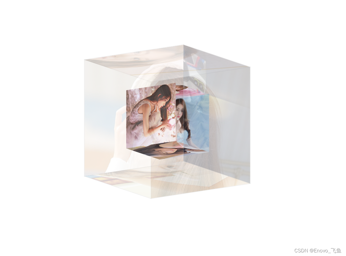
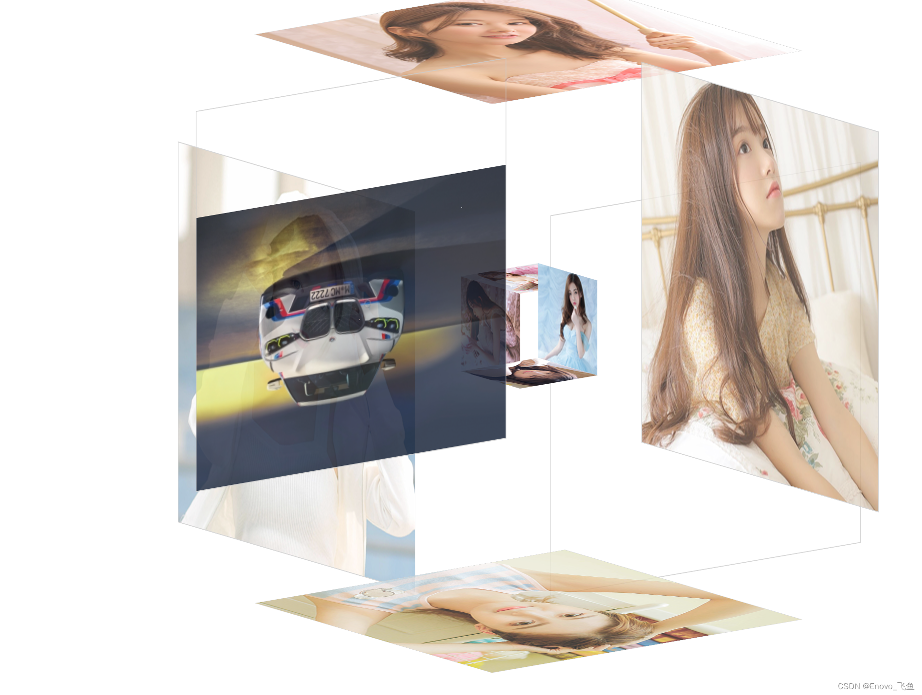
三、效果展示
让我们一起,欣赏吧!!!
A.正常打开效果
B.鼠标放置
 C.添加图片
注意哦!!!
可以在此基础上添加背景音乐,点击特效,背景图等
特别提醒一下大家,注意图片像素(尺寸),否则会显示不出来的/(ㄒoㄒ)/~~
四、详细介绍
第一点: 3D旋转相册,顾名思义
第二点: 可以自由添加背景音乐,背景图等
第三点: 可以用在多种情景,普通相册展示,介绍等
五、编码实现
显示完整代码
注意路径(⊙o⊙)?
o(* ̄▽ ̄*)ブ
(ง •_•)ง
index.html
<!DOCTYPE html>
<html lang="en">
<head>
<meta charset="UTF-8">
<title>Enovo3D相册</title>

<link type="text/css" href="css/style.css" rel="stylesheet" />

</head>
<body>

<div class="box">
	<ul class="minbox">
		<li></li>
		<li></li>
		<li></li>
		<li></li>
		<li></li>
		<li></li>
	</ul>
	<ol class="maxbox">
		<li></li>
		<li></li>
		<li></li>
		<li></li>
		<li></li>
		<li></li>
	</ol>
</div>
</body>
</html>
style.css
@charset "utf-8";
*{
	margin:0;
	padding:0;
}
body{

	/*background: url(../img/preview.png) ;*/
	max-width: 100%;
	min-width: 100%;
	height: 100%;
	background-size: cover;
	background-repeat: no-repeat;
	background-attachment: fixed;
	background-size:100% 100%;
	position: absolute;
	margin-left: auto;
	margin-right: auto;
}
li{
	list-style: none;
}
.box{
	width:200px;
	height:200px;
	background-size: cover;
	background-repeat: no-repeat;
	background-attachment: fixed;
	background-size:100% 100%;
	position: absolute;
	margin-left: 42%;
	margin-top: 22%;
	-webkit-transform-style:preserve-3d;
	-webkit-transform:rotateX(13deg);
	-webkit-animation:move 5s linear infinite;
}
.minbox{
	width:100px;
	height:100px;
	position: absolute;
	left:50px;
	top:30px;
	-webkit-transform-style:preserve-3d;
}
.minbox li{
	width:100px;
	height:100px;
	position: absolute;
	left:0;
	top:0;
}
.minbox li:nth-child(1){
	background: url(../img/01.png) no-repeat 0 0;
	-webkit-transform:translateZ(50px);
}
.minbox li:nth-child(2){
	background: url(../img/02.png) no-repeat 0 0;
	-webkit-transform:rotateX(180deg) translateZ(50px);
}
.minbox li:nth-child(3){
	background: url(../img/03.png) no-repeat 0 0;
	-webkit-transform:rotateX(-90deg) translateZ(50px);
}
.minbox li:nth-child(4){
	background: url(../img/04.png) no-repeat 0 0;
	-webkit-transform:rotateX(90deg) translateZ(50px);
}
.minbox li:nth-child(5){
	background: url(../img/05.png) no-repeat 0 0;
	-webkit-transform:rotateY(-90deg) translateZ(50px);
}
.minbox li:nth-child(6){
	background: url(../img/06.png) no-repeat 0 0;
	-webkit-transform:rotateY(90deg) translateZ(50px);
}
.maxbox li:nth-child(1){
	background: url(../img/1.png) no-repeat 0 0;
	-webkit-transform:translateZ(50px);
}
.maxbox li:nth-child(2){
	background: url(../img/2.png) no-repeat 0 0;
	-webkit-transform:translateZ(50px);
}
.maxbox li:nth-child(3){
	background: url(../img/3.png) no-repeat 0 0;
	-webkit-transform:rotateX(-90deg) translateZ(50px);
}
.maxbox li:nth-child(4){
	background: url(../img/4.png) no-repeat 0 0;
	-webkit-transform:rotateX(90deg) translateZ(50px);
}
.maxbox li:nth-child(5){
	background: url(../img/5.png) no-repeat 0 0;
	-webkit-transform:rotateY(-90deg) translateZ(50px);
}
.maxbox li:nth-child(6){
	background: url(../img/6.png) no-repeat 0 0;
	-webkit-transform:rotateY(90deg) translateZ(50px);
}
.maxbox{
	width: 800px;
	height: 400px;
	position: absolute;
	left: 0;
	top: -20px;
	-webkit-transform-style: preserve-3d;

}
.maxbox li{
	width: 200px;
	height: 200px;
	background: #fff;
	border:1px solid #ccc;
	position: absolute;
	left: 0;
	top: 0;
	opacity: 0.2;
	-webkit-transition:all 1s ease;
}
.maxbox li:nth-child(1){
	-webkit-transform:translateZ(100px);
}
.maxbox li:nth-child(2){
	-webkit-transform:rotateX(180deg) translateZ(100px);
}
.maxbox li:nth-child(3){
	-webkit-transform:rotateX(-90deg) translateZ(100px);
}
.maxbox li:nth-child(4){
	-webkit-transform:rotateX(90deg) translateZ(100px);
}
.maxbox li:nth-child(5){
	-webkit-transform:rotateY(-90deg) translateZ(100px);
}
.maxbox li:nth-child(6){
	-webkit-transform:rotateY(90deg) translateZ(100px);
}
.box:hover ol li:nth-child(1){
	-webkit-transform:translateZ(300px);
	width: 400px;
	height: 400px;
	opacity: 0.8;
	left: -100px;
	top: -100px;
}
.box:hover ol li:nth-child(2){
	-webkit-transform:rotateX(180deg) translateZ(300px);
	width: 400px;
	height: 400px;
	opacity: 0.8;
	left: -100px;
	top: -100px;
}
.box:hover ol li:nth-child(3){
	-webkit-transform:rotateX(-90deg) translateZ(300px);
	width: 400px;
	height: 400px;
	opacity: 0.8;
	left: -100px;
	top: -100px;
}
.box:hover ol li:nth-child(4){
	-webkit-transform:rotateX(90deg) translateZ(300px);
	width: 400px;
	height: 400px;
	opacity: 0.8;
	left: -100px;
	top: -100px;
}
.box:hover ol li:nth-child(5){
	-webkit-transform:rotateY(-90deg) translateZ(300px);
	width: 400px;
	height: 400px;
	opacity: 0.8;
	left: -100px;
	top: -100px;
}
.box:hover ol li:nth-child(6){
	-webkit-transform:rotateY(90deg) translateZ(300px);
	width: 400px;
	height: 400px;
	opacity: 0.8;
	left: -100px;
	top: -100px;
}
@keyframes move{
	0%{
		-webkit-transform: rotateX(13deg) rotateY(0deg);
	}
	100%{
		-webkit-transform:rotateX(13deg) rotateY(360deg);
	}
}
img
一定注意image文件的路径噢!!!
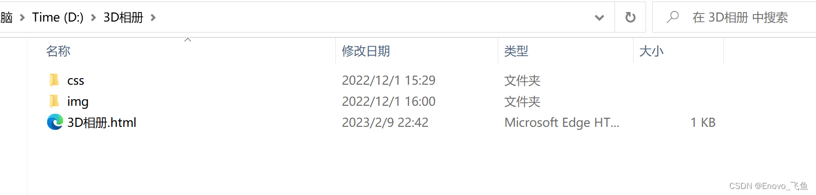
六、获取源码
老规矩,先给朋友们看一下完整文件夹,
正确的文件如下图 ,复制源码的朋友们请注意了!!!
公众号获取源码
第一步,通过微信公众号下载源码压缩包,解压并打开文件夹,即为上图样式(复制源码请注意路径及文件名)
第二步,点击 html 文件 打开即可查看
2023年第十八期,希望得到大家的喜欢
本文内容由网友自发贡献,版权归原作者所有,本站不承担相应法律责任。如您发现有涉嫌抄袭侵权的内容,请联系:hwhale#tublm.com(使用前将#替换为@)