七夕快要到了,下面来看几个玫瑰,选一个合适的送给心仪的"ta"把
第一束
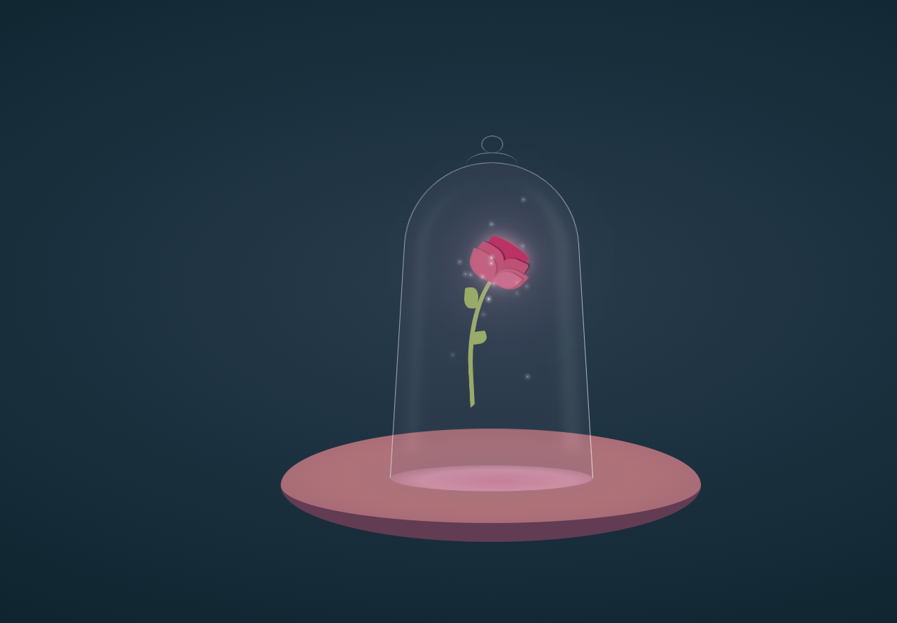
index页面
<!DOCTYPE html>
<html lang="en" >
<head>
  <meta charset="UTF-8">
  <title>CodePen - Beauty and The Beast rose</title>
  <link rel="stylesheet" href="./style.css">

</head>
<body>
<!-- partial:index.partial.html -->
<div id="castle">
  <div id="table"></div>
  <div class="shade-wrap hover-animation" id="main">
    <div id="flower-wrap">
      <div id="stem"></div>
      <div id="petal1"></div>
      <div id="petal2"></div>
      <div id="petal3"></div>
      <div id="petal4"></div>
      <div id="petal5"></div>
      <div id="falling-petal"></div>
      <div id="leaf1"></div>
      <div id="leaf2"></div>
    </div>
  </div>
  <div class="shade-wrap" id="sub">
    <div id="shade-main-reflections"></div>
    <div id="shade-main">
      <div id="shade-handle-big"></div>
      <div id="shade-handle-small"></div>
      <div id="top-reflection"></div>
      <div id="bottom-shade"></div>
    </div>
  </div>
</div>
<!-- partial -->
  <script  src="./script.js"></script>

</body>
</html>
js代码
(() => {

  const head = document.getElementsByTagName('head')[0];
  let animationId = 1;

  function CreateMagicDust(x1, x2, y1, y2, sizeRatio, fallingTime, animationDelay, node = 'main') {
    let dust = document.createElement('span');
    let animation = document.createElement('style');
        animation.innerHTML = '\
        @keyframes blink' + animationId + '{\
            0% {\
                top: ' + y1 + 'px;\
                left: ' + x1 + 'px;\
                width: ' + 2*sizeRatio + 'px;\
                height: ' + 2*sizeRatio + 'px;\
                opacity: .4\
            }\
            20% {\
                width: ' + 4*sizeRatio + 'px;\
                height: ' + 4*sizeRatio + 'px;\
                opacity: .8\
            }\
            35% {\
                width: ' + 2*sizeRatio + 'px;\
                height: ' + 2*sizeRatio + 'px;\
                opacity: .5\
            }\
            55% {\
                width: ' + 3*sizeRatio + 'px;\
                height: ' + 3*sizeRatio + 'px;\
                opacity: .7\
            }\
            80% {\
                width: ' + sizeRatio + 'px;\
                height: ' + sizeRatio + 'px;\
                opacity: .3\
            }\
            100% {\
                top: ' + y2 + 'px;\
                left: ' + x2 + 'px;\
                width: ' + 0 + 'px;\
                height: ' + 0 + 'px;\
                opacity: .1\
            }}';
      head.appendChild(animation);
    dust.classList.add('dustDef');
    dust.setAttribute('style', `animation: blink${animationId++} ${fallingTime}s cubic-bezier(.71, .11, .68, .83) infinite ${animationDelay}s`);
      document.getElementById(node).appendChild(dust);
  }

   // yes, I'm doing it manually to get the effect I want.. can be easily changed to render randomly
   [[130, 132, 150, 152, .15, 2.5,.1, 'sub'],
      [65, 63, 300, 299, .5, 2, .2, 'sub' ],
      [70, 70, 150, 150, .45, 2, .5],
      [75, 78, 160, 170, .6, 2, 1],
      [80, 82, 160, 180, .6, 1, .4],
      [85, 100, 160, 170, .5, 2, .5],
      [125, 110, 170, 180, .25, 3, 1.5],
      [90, 90, 115, 115, .4, 2, 2],
      [93, 95, 200, 200, .4, 3, 1.5],
      [100, 100, 145, 155, .45, 1, .5],
      [100, 90, 170, 230, .35, 2, .75],
      [100, 102, 115, 112, .35, 3, .25],
      [100, 95, 170, 200, .55, 1.5, .75],
      [100, 97, 150, 190, .7, 2, 1.5],
      [105, 100, 160, 180, .5, 1.5, .725],
      [125, 125, 180, 190, .25, 1, .725],
      [130, 130, 135, 135, .45, 3, 1.5],
      [135, 132, 170, 190, .25, 2.5, .75],
      [135, 132, 320, 315, .2, 5, .3, 'sub']
   ].forEach((o) => CreateMagicDust(...o));

})();
css代码
* {
  margin: 0;
  padding: 0;
}

.hover-animation {
  animation: hover 1.75s ease-in-out infinite;
}

#castle {
  position: relative;
  width: 100vw;
  height: 100vh;
  background: radial-gradient(#293c4d, #001920);
  overflow: hidden;
}
#castle #table {
  position: absolute;
  left: calc(50% - 200px);
  top: calc(50% - 50px);
  width: 400px;
  height: 400px;
  background: radial-gradient(#a3727e, #af7279, #a16674);
  border-radius: 100%;
  border-bottom: 80px solid #623c53;
  transform: scaleY(0.225);
}
#castle .shade-wrap {
  position: absolute;
  left: calc(50% - 100px);
  top: calc(52% - 250px);
  width: 200px;
  height: 400px;
}
#castle .shade-wrap #shade-main {
  position: absolute;
  left: 20px;
  top: 100px;
  width: 160px;
  height: 300px;
  border-top: 1px solid rgba(255, 255, 255, 0.5);
  border-left: 1px solid rgba(255, 255, 255, 0.5);
  border-right: 1px solid rgba(255, 255, 255, 0.6);
  border-top-left-radius: 50% 30%;
  border-top-right-radius: 50% 30%;
  border-bottom: none;
  transform: perspective(200px) rotateX(8deg) scale(1.075, 1);
}
#castle .shade-wrap #shade-main #shade-handle-big {
  position: absolute;
  left: 55px;
  top: -14px;
  width: 50px;
  height: 30px;
  border-radius: 100%;
  border-top: 1px solid rgba(255, 255, 255, 0.7);
  transform: scaleY(0.9);
}
#castle .shade-wrap #shade-main #shade-handle-small {
  position: absolute;
  left: 70px;
  top: -33px;
  width: 20px;
  height: 20px;
  border-radius: 100%;
  border: 1px solid rgba(255, 255, 255, 0.5);
  border-bottom: none;
}
#castle .shade-wrap #shade-main #bottom-shade {
  position: absolute;
  bottom: -20px;
  width: 100%;
  height: 40px;
  transform: scaleY(0.5);
  border-radius: 100%;
  background: radial-gradient(#d287a5, #da9db6, #985e74);
  animation: floatAnimate 1.75s ease-in-out infinite;
}
#castle .shade-wrap #shade-main-reflections {
  position: relative;
  left: 20px;
  top: 100px;
  width: 160px;
  height: 300px;
  border-top-left-radius: 50% 30%;
  border-top-right-radius: 50% 30%;
  border-bottom: none;
  background-color: #6d6179;
  transform: perspective(200px) rotateX(8deg) scale(1.075, 1);
  opacity: 0.15;
}
#castle .shade-wrap #shade-main-reflections:after {
  content: "";
  position: absolute;
  width: 100%;
  height: 100%;
  border-top-right-radius: 50% 30%;
  border-right: 20px solid rgba(255, 255, 255, 0.5);
  transform: scale(0.7, 0.85);
  filter: blur(5px);
}
#castle .shade-wrap #shade-main-reflections:before {
  content: "";
  position: absolute;
  width: 100%;
  height: 100%;
  border-top-left-radius: 50% 30%;
  border-left: 8px solid rgba(255, 255, 255, 0.6);
  transform: scale(0.85, 0.85);
  filter: blur(5px);
}
#castle .shade-wrap #flower-wrap {
  position: relative;
  top: -50px;
}
#castle .shade-wrap #flower-wrap #stem {
  position: absolute;
  left: 82px;
  top: 187px;
  width: 100px;
  height: 150px;
  background-color: transparent;
  border: solid 4px #a1b965;
  border-color: transparent transparent transparent #a1b965;
  border-radius: 50%/120px 100px 0 0;
  transform: rotate(-3deg) scale(1.1, 0.9);
}
#castle .shade-wrap #flower-wrap #petal1 {
  position: absolute;
  left: 97px;
  top: 188px;
  width: 25px;
  height: 25px;
  border-top-left-radius: 50% 10%;
  border-top-right-radius: 50% 10%;
  border-bottom-left-radius: 50% 40%;
  border-bottom-right-radius: 50% 40%;
  background-color: #c82b60;
  box-shadow: 1px -1px 1px 0 #6f1232;
  transform: rotate(32deg) scale(1.6, 1.6);
}
#castle .shade-wrap #flower-wrap #petal1:before {
  content: "";
  position: absolute;
  height: 100%;
  width: 100%;
  border-top-left-radius: 50% 10%;
  border-top-right-radius: 50% 10%;
  border-bottom-left-radius: 50% 40%;
  border-bottom-right-radius: 50% 40%;
  background-color: transparent;
  box-shadow: 0 0 10px 0 #e8b2ca;
  opacity: 0.9;
}
#castle .shade-wrap #flower-wrap #petal1:after {
  content: "";
  position: absolute;
  height: 100%;
  width: 100%;
  border-top-left-radius: 50% 10%;
  border-top-right-radius: 50% 10%;
  border-bottom-left-radius: 50% 40%;
  border-bottom-right-radius: 50% 40%;
  background-color: transparent;
  box-shadow: 0 0 35px 0 #e8b2ca;
  animation: glow 3s ease-in-out infinite;
}
#castle .shade-wrap #flower-wrap #petal2 {
  position: absolute;
  left: 85px;
  top: 185px;
  width: 25px;
  height: 30px;
  border-top-left-radius: 50% 10%;
  border-top-right-radius: 50% 50%;
  border-bottom-left-radius: 50% 50%;
  border-bottom-right-radius: 50% 10%;
  background-color: #d05478;
  transform: rotate(35deg) scale(1.2, 1);
  box-shadow: 1px -1px 1px 0 #6f1232;
  opacity: 0.9;
}
#castle .shade-wrap #flower-wrap #petal3 {
  position: absolute;
  left: 105px;
  top: 197px;
  width: 25px;
  height: 28px;
  border-top-left-radius: 50% 50%;
  border-top-right-radius: 10% 10%;
  border-bottom-left-radius: 10% 10%;
  border-bottom-right-radius: 50% 50%;
  background-color: #cb5275;
  transform: rotate(25deg) scale(1, 1.05) skew(-8deg);
  box-shadow: 1px -1px 1px 0 #6f1232;
  opacity: 0.9;
}
#castle .shade-wrap #flower-wrap #petal4 {
  position: absolute;
  left: 80px;
  top: 191px;
  width: 25px;
  height: 25px;
  border-top-left-radius: 50% 10%;
  border-top-right-radius: 50% 50%;
  border-bottom-left-radius: 50% 50%;
  border-bottom-right-radius: 50% 10%;
  background-color: #d26484;
  transform: rotate(30deg) scale(1.1, 0.9) skew(10deg);
  box-shadow: 1px -1px 1px 0 #a53d60;
  opacity: 0.9;
}
#castle .shade-wrap #flower-wrap #petal5 {
  position: absolute;
  left: 105px;
  top: 207px;
  width: 25px;
  height: 20px;
  border-top-left-radius: 50% 50%;
  border-top-right-radius: 10% 10%;
  border-bottom-left-radius: 10% 10%;
  border-bottom-right-radius: 50% 50%;
  background-color: #d26484;
  transform: rotate(28deg) scale(1, 1.05) skew(-18deg);
  box-shadow: 1px -1px 1px 0 #a53d60;
  opacity: 0.9;
}
#castle .shade-wrap #flower-wrap #falling-petal {
  position: absolute;
  left: 105px;
  top: 209px;
  width: 22px;
  height: 18px;
  border-top-left-radius: 50% 50%;
  border-top-right-radius: 10% 10%;
  border-bottom-left-radius: 10% 10%;
  border-bottom-right-radius: 50% 50%;
  background-color: #da7290;
  transform: rotate(32deg) scale(0.9, 0.95) skew(-18deg);
  box-shadow: 1px -1px 1px 0 #a53d60;
  opacity: 0.9;
  animation: 7s fall 4s ease-in-out infinite;
}
#castle .shade-wrap #flower-wrap #leaf1 {
  position: absolute;
  left: 75px;
  top: 225px;
  width: 13px;
  height: 20px;
  border-top-left-radius: 50% 10%;
  border-top-right-radius: 50% 50%;
  border-bottom-left-radius: 50% 50%;
  border-bottom-right-radius: 50% 10%;
  background-color: #a1b965;
  transform: rotate(5deg);
}
#castle .shade-wrap #flower-wrap #leaf2 {
  position: absolute;
  left: 82px;
  top: 265px;
  width: 12px;
  height: 16px;
  border-top-left-radius: 50% 10%;
  border-top-right-radius: 50% 50%;
  border-bottom-left-radius: 50% 50%;
  border-bottom-right-radius: 50% 10%;
  background-color: #a1b965;
  transform: rotate(-97deg);
}

.dustDef {
  position: absolute;
  background-color: white;
  border-radius: 100%;
  box-shadow: 0 0 3px 1px white;
  opacity: 0;
}

@keyframes hover {
  0% {
    margin-top: 60px;
  }
  50% {
    margin-top: 50px;
  }
  100% {
    margin-top: 60px;
  }
}
@keyframes glow {
  0% {
    box-shadow: 0 0 25px 0 #e8b2ca;
  }
  50% {
    box-shadow: 0 0 45px 0 #e8b2ca;
  }
  100% {
    box-shadow: 0 0 25px 0 #e8b2ca;
  }
}
@keyframes fall {
  5% {
    top: 209px;
    left: 105px;
    transform: rotate(55deg) scale(0.9, 0.95) skew(-18deg);
    opacity: 0.9;
  }
  30% {
    left: 90px;
  }
  55% {
    left: 130px;
  }
  60%, 100% {
    top: 380px;
    transform: rotate(30deg) scale(0.9, 0.95) skew(-32deg);
    opacity: 0;
  }
}
@keyframes floatAnimate {
  0% {
    background-size: 105% 120%;
    background-position: 0 0;
    opacity: 0.7;
  }
  50% {
    background-size: 100% 100%;
    background-position: 0 0;
    opacity: 0.5;
  }
  100% {
    background-size: 105% 120%;
    background-position: 0 0;
    opacity: 0.7;
  }
}
第二束

html部分
<!DOCTYPE html>
<html lang="en" >
<head>
  <meta charset="UTF-8">
  <title>CodePen - blooming rose</title>
  <link rel="stylesheet" href="./style.css">

</head>
<body>
<!-- partial:index.partial.html -->
<div>
<?xml version="1.0" encoding="utf-8"?>
<svg  id='svg' width='400px' viewBox="0 0 188 264" xmlns="http://www.w3.org/2000/svg">
 <defs>
    <radialGradient id="gradient-0" gradientUnits="userSpaceOnUse" cx="-107.308" cy="104.329" r="59.181" gradientTransform="matrix(0.261752, 0.411262, -0.686293, 0.596934, 160.094667, 49.38985)">
      <stop offset="0" style="stop-color: rgb(255, 0, 0);"/>
      <stop offset="1" style="stop-color: rgb(141, 41, 41);"/>
    </radialGradient>
    <radialGradient id="gradient-1" gradientUnits="userSpaceOnUse" cx="113.342" cy="62.644" r="53.882" gradientTransform="matrix(-0.169507, 1.182475, -0.714039, -0.308382, 160.212434, -46.522622)">
      <stop offset="0" style="stop-color: rgb(255, 0, 0);"/>
      <stop offset="1" style="stop-color: rgb(141, 41, 41);"/>
    </radialGradient>
    <radialGradient id="gradient-4" gradientUnits="userSpaceOnUse" cx="127.727" cy="116.674" r="45.581" gradientTransform="matrix(-0.468422, -1.651974, 0.962071, -0.272798, 74.446964, 391.898588)">
      <stop offset="0" style="stop-color: rgb(255, 0, 0);"/>
      <stop offset="1" style="stop-color: rgb(141, 41, 41);"/>
    </radialGradient>
    <radialGradient id="gradient-6" gradientUnits="userSpaceOnUse" cx="43.926" cy="85.895" r="44.319" gradientTransform="matrix(1.145876, -0.154456, 0.133585, 0.991037, 18.521778, 10.448842)">
      <stop offset="0" style="stop-color: rgb(56, 16, 16);"/>
      <stop offset="1" style="stop-color: rgb(255, 0, 0);"/>
    </radialGradient>
    <radialGradient id="gradient-7" gradientUnits="userSpaceOnUse" cx="70.257" cy="63.907" r="38.537" gradientTransform="matrix(-0.480251, 0.463812, -0.694689, -0.719311, 216.251059, 74.926092)">
      <stop offset="0" style="stop-color: rgb(255, 0, 0);"/>
      <stop offset="1" style="stop-color: rgb(141, 41, 41);"/>
    </radialGradient>
    <radialGradient id="gradient-8" gradientUnits="userSpaceOnUse" cx="99.231" cy="116.778" r="19.209" gradientTransform="matrix(0.18829, -1.009689, 0.983052, 0.183324, -48.104751, 172.536193)">
      <stop offset="0" style="stop-color: rgb(51, 13, 13);"/>
      <stop offset="1" style="stop-color: rgb(255, 0, 0);"/>
    </radialGradient>
    <radialGradient id="gradient-9" gradientUnits="userSpaceOnUse" cx="77.314" cy="119.309" r="20.726" gradientTransform="matrix(-1.623871, -1.229366, 0.603596, -0.79729, 122.245012, 298.564429)">
      <stop offset="0" style="stop-color: rgb(115, 42, 42);"/>
      <stop offset="1" style="stop-color: rgb(255, 0, 0);"/>
    </radialGradient>
    <radialGradient id="gradient-10" gradientUnits="userSpaceOnUse" cx="91.275" cy="115.836" r="34.163">
      <stop offset="0" style="stop-color: rgb(255, 0, 0);"/>
      <stop offset="1" style="stop-color: rgb(141, 41, 41);"/>
    </radialGradient>
    <radialGradient id="gradient-11" gradientUnits="userSpaceOnUse" cx="87.793" cy="121.847" r="7.864" gradientTransform="matrix(-0.305698, -2.998266, 0.994843, -0.101432, -6.587452, 397.432981)">
      <stop offset="0" style="stop-color: rgb(255, 0, 0);"/>
      <stop offset="1" style="stop-color: rgb(95, 30, 30);"/>
    </radialGradient>
    <radialGradient id="gradient-12" gradientUnits="userSpaceOnUse" cx="77.806" cy="136.077" r="46.618" gradientTransform="matrix(1.007103, 0, 0, 1.028773, 3.509742, -3.183751)">
      <stop offset="0" style="stop-color: rgb(255, 0, 0);"/>
      <stop offset="1" style="stop-color: rgb(141, 41, 41);"/>
    </radialGradient>
    <radialGradient id="gradient-13" gradientUnits="userSpaceOnUse" cx="34.864" cy="119.976" r="36.699" gradientTransform="matrix(-0.483999, -0.503131, 0.29077, -1.102951, 30.968876, 262.661348)">
      <stop offset="0" style="stop-color: rgb(67, 88, 0);"/>
      <stop offset="1" style="stop-color: rgb(173, 183, 141);"/>
    </radialGradient>
    <radialGradient id="gradient-14" gradientUnits="userSpaceOnUse" cx="41.572" cy="155.958" r="37.322" gradientTransform="matrix(0.598359, 0, -0.729427, 1.012048, 147.786285, -2.069081)">
      <stop offset="0" style="stop-color: rgb(64, 78, 18);"/>
      <stop offset="1" style="stop-color: #758d29"/>
    </radialGradient>
    <radialGradient id="gradient-15" gradientUnits="userSpaceOnUse" cx="107.613" cy="177.189" r="41.15" gradientTransform="matrix(0.722745, 0, 0, 0.553521, 18.427466, 66.94198)">
      <stop offset="0" style="stop-color: rgb(99, 121, 28);"/>
      <stop offset="1" style="stop-color: rgb(62, 76, 14);"/>
    </radialGradient>
    <linearGradient id="gradient-16" gradientUnits="userSpaceOnUse" x1="79.232" y1="148.661" x2="79.232" y2="267.785" gradientTransform="matrix(0.025831, -0.999666, 0.153237, 0.00396, 43.953685, 274.434674)">
      <stop offset="0" style="stop-color: #bada55"/>
      <stop offset="1" style="stop-color: rgb(59, 72, 14);"/>
    </linearGradient>
    <radialGradient id="gradient-2" gradientUnits="userSpaceOnUse" cx="33.089" cy="83.922" r="27.475" gradientTransform="matrix(0.758528, 1.916342, -0.693287, 0.585241, 83.304087, -39.360742)">
      <stop offset="0" style="stop-color: rgb(255, 0, 0);"/>
      <stop offset="1" style="stop-color: rgb(141, 41, 41);"/>
    </radialGradient>
  </defs>
  <path d="M 73.281 159.571 C 72.647 190.375 75.055 224.982 80.506 263.392 C 81.129 267.785 93.817 263.392 93.817 263.392 C 92.284 264.35 81.135 187.678 88.112 161.093 C 90.388 152.419 77.266 148.661 73.281 159.571 Z" style="stroke: rgba(0, 0, 0, 0); fill: url(#gradient-16);"><animate repeats='1' id='animate0' begin='indefinite' fill='freeze' calcMode='spline' keySplines='0 .06 0 .97' keyTimes='0;1' attributeName='d' dur='12000ms' to="M 69.281 159.571 C 68.647 190.375 71.055 224.982 76.506 263.392 C 77.129 267.785 89.817 263.392 89.817 263.392 C 88.284 264.35 77.135 187.678 84.112 161.093 C 86.388 152.419 73.266 148.661 69.281 159.571 Z"/> </path>
  <path d="M 46.953 119.95 C 45.235 117.533 42.584 112.794 41.114 110.103 C 40.46 108.906 40.478 108.549 40.039 108.114 C 35.996 104.1 26.687 103.38 26.687 103.38 C 26.687 103.38 34.854 97.115 39.086 97.698 C 44.858 98.492 50.547 103.452 55.298 110.008 C 62.512 119.962 72.703 149.303 72.703 149.303 C 72.703 149.303 55.029 131.31 46.953 119.95 Z" style="stroke: rgba(0, 0, 0, 0); fill: url(#gradient-13);"><animate repeats='1' id='animate1' begin='indefinite' fill='freeze' calcMode='spline' keySplines='0 .06 0 .97' keyTimes='0;1' attributeName='d' dur='12000ms' to="M 31.631 125.725 C 28.891 123.784 24.662 119.977 22.317 117.816 C 21.274 116.854 21.302 116.567 20.603 116.218 C 14.153 112.994 -0.694 112.415 -0.694 112.415 C -0.694 112.415 12.333 107.383 19.082 107.851 C 28.289 108.489 37.364 112.473 44.942 117.739 C 56.448 125.735 72.703 149.303 72.703 149.303 C 72.703 149.303 44.513 134.85 31.631 125.725 Z"/> </path>
  <path d="M 125.945 180.107 L 109.454 169.372 C 106.365 165.002 109.271 159.533 100.933 155.899 C 94.395 153.05 66.464 149.933 78.394 155.058 C 93.119 161.382 82.057 170.1 125.945 180.107 Z" style="stroke: rgba(0, 0, 0, 0); fill: url(#gradient-15);"><animate repeats='1' id='animate2' begin='indefinite' fill='freeze' calcMode='spline' keySplines='0 .06 0 .97' keyTimes='0;1' attributeName='d' dur='12000ms' to="M 148.763 204.446 L 125.945 185.051 C 121.672 177.156 125.693 167.276 114.156 160.712 C 105.11 155.565 66.464 149.933 82.971 159.191 C 103.344 170.617 88.039 186.367 148.763 204.446 Z"/> </path>
  <path d="M 90.099 156.29 C 88.891 153.292 90.921 155.595 93.141 153.247 C 98.208 147.888 95.989 137.519 101.888 133.092 C 108.341 128.25 113.536 123.721 107.972 117.88 C 97.368 106.747 107.951 83.841 112.536 84.414 C 112.536 84.414 113.025 78.245 118.24 79.85 C 123.087 81.341 135.801 78.415 137.255 83.273 C 138.221 86.5 136.354 90.548 133.832 92.78 C 131.69 94.675 127.25 92.447 125.466 94.682 C 124.517 95.871 123.465 94.713 122.424 95.822 C 121.033 97.303 119.381 99.626 119.381 99.626 C 119.381 99.626 121.654 92.196 120.141 104.95 C 119.318 111.882 120.656 105.712 117.48 117.879 C 115.795 124.332 120.84 127.039 111.015 143.74 C 108.626 147.8 106.597 153.874 101.888 154.008 C 98.64 154.1 91.313 159.304 90.099 156.29 Z" style="fill: url(#gradient-4); stroke: rgba(255, 0, 0, 0);"><animate repeats='1' id='animate3' begin='indefinite' fill='freeze' calcMode='spline' keySplines='0 .06 0 .97' keyTimes='0;1' attributeName='d' dur='12000ms' to="M 88.958 161.994 C 87.75 158.996 90.921 155.595 93.141 153.247 C 98.208 147.888 106.637 147.026 112.536 142.599 C 118.989 137.757 124.478 131.678 129.649 125.486 C 137.065 116.606 149.425 96.964 149.425 96.964 C 149.425 96.964 160.562 94.598 165.777 96.203 C 170.624 97.694 176.493 100.472 177.947 105.33 C 178.913 108.557 177.046 112.605 174.524 114.837 C 172.382 116.732 167.942 114.504 166.158 116.739 C 165.209 117.928 167.199 120.193 166.158 121.302 C 164.767 122.783 160.073 121.683 160.073 121.683 C 160.073 121.683 155.121 139.733 149.044 146.402 C 144.342 151.562 137.389 154.391 130.79 156.67 C 124.486 158.847 117.417 157.843 111.015 159.712 C 106.493 161.032 102.794 165.283 98.085 165.417 C 94.837 165.509 90.172 165.008 88.958 161.994 Z"/> </path>
  <path d="M 62.176 137.894 C 59.831 133.766 59.753 126.528 57.254 118.879 C 55.976 114.967 56.069 106.679 54.167 102.907 C 52.326 99.257 52.23 94.76 50.378 91.118 C 47.918 86.281 50.766 86.433 41.044 80.85 C 36.499 78.24 31.211 82.949 33.109 78.188 C 36.417 69.886 50.787 73.079 57.47 68.3 C 60.05 66.455 63.869 64.244 67.014 63.357 C 68.178 63.028 70.383 64.878 70.383 64.878 C 70.383 64.878 71.908 61.837 75.047 62.975 C 75.047 62.975 76.907 66.637 80.141 64.117 C 83.6 61.423 82.944 65.721 86.799 67.54 C 94.384 71.119 94.482 74.765 94.482 74.765 C 128.904 119.447 94.989 195.653 62.176 137.894 Z" style="fill: url(#gradient-0); stroke: rgba(255, 0, 0, 0);"><animate repeats='1' id='animate4' begin='indefinite' fill='freeze' calcMode='spline' keySplines='0 .06 0 .97' keyTimes='0;1' attributeName='d' dur='12000ms' to="M 44.942 120.781 C 41.293 117.204 34.996 117.021 31.631 113.175 C 28.748 109.88 28.911 104.778 26.688 101.006 C 24.536 97.356 20.866 94.76 18.701 91.118 C 15.826 86.281 12.931 81.109 12.236 75.526 C 11.587 70.314 12.3 64.695 14.518 59.934 C 18.386 51.632 24.959 44.177 32.772 39.398 C 35.788 37.553 39.364 37.623 43.04 36.736 C 44.401 36.407 43.421 32.553 43.421 32.553 C 43.421 32.553 44.315 31.034 47.984 32.172 C 47.984 32.172 51.048 22.903 54.829 20.383 C 58.872 17.689 64.775 16.663 69.281 18.482 C 78.148 22.061 87.155 40.919 87.155 40.919 C 129.95 85.497 103.042 177.736 44.942 120.781 Z"/> </path>
  <path d="M 70.914 71.237 L 76.638 69.198 C 77.362 66.255 89.209 45.785 90.524 68.715 C 90.661 71.103 93.14 66.504 93.14 66.504 C 93.14 66.504 98.766 61.707 101.007 62.911 C 106.081 65.636 109.6 59.835 112.863 65.977 C 118.208 76.036 108.947 85.333 108.52 96.88 C 108.213 105.193 114.806 116.288 111.821 123.103 C 109.37 128.702 107.584 146.029 107.584 146.029 C 80.053 193.792 53.77 100.982 70.914 71.237 Z" style="fill: url(#gradient-1); stroke: rgba(255, 0, 0, 0);" transform="matrix(0.99135, 0.131244, -0.131244, 0.99135, 15.956242, -10.615298)"><animate repeats='1' id='animate5' begin='indefinite' fill='freeze' calcMode='spline' keySplines='0 .06 0 .97' keyTimes='0;1' attributeName='d' dur='12000ms' to="M 73.464 53.849 L 87.535 41.68 C 87.535 41.68 105.977 36.949 113.775 40.919 C 116.376 42.243 118.719 48.145 118.719 48.145 C 118.719 48.145 125.275 48.072 128.227 49.286 C 134.91 52.035 141.618 56.401 145.34 62.596 C 151.436 72.743 153.533 85.935 151.425 97.583 C 149.908 105.969 143.531 112.765 138.495 119.64 C 134.358 125.288 124.424 135.233 124.424 135.233 C 79.951 183.412 45.768 83.853 73.464 53.849 Z"/> </path>
  <path d="M 79.028 139.796 C 79.028 139.796 70.453 142.266 65.687 144.415 C 61.432 146.333 57 148.408 52.224 151.728 C 47.552 154.975 42.312 161.308 37.936 163.659 C 34.523 165.493 30.327 164.428 30.327 164.428 C 40.91 171.741 56.429 169.047 76.884 156.346 C 84.002 151.926 84.717 146.409 79.028 139.796 Z" style="stroke: rgba(0, 0, 0, 0); fill: url(#gradient-14);"><animate repeats='1' id='animate6' begin='indefinite' fill='freeze' calcMode='spline' keySplines='0 .06 0 .97' keyTimes='0;1' attributeName='d' dur='12000ms' to="M 55.97 140.176 C 55.97 140.176 44.615 142.617 39.237 144.74 C 34.437 146.635 29.53 148.686 25.547 151.966 C 21.65 155.175 20.521 161.432 16.039 163.755 C 12.543 165.567 4.25 164.515 4.25 164.515 C 30.744 171.741 53.435 169.079 72.323 156.529 C 78.894 152.162 73.443 146.711 55.97 140.176 Z"/> </path>
  <path d="M 105.028 130.668 C 98.146 97.987 126.006 49.499 85.253 68.681 C 54.631 83.094 48.236 181.015 105.028 130.668 Z" style="stroke: rgba(0, 0, 0, 0); fill: url(#gradient-7);"><animate repeats='1' id='animate7' begin='indefinite' fill='freeze' calcMode='spline' keySplines='0 .06 0 .97' keyTimes='0;1' attributeName='d' dur='12000ms' to="M 112.254 128.767 C 132.537 99.358 127.585 45.893 100.845 62.596 C 72.14 80.525 55.462 179.114 112.254 128.767 Z"/> </path>
  <path d="M 67.428 133.685 L 66.92 115.513 C 58.539 81.763 60.825 70.019 73.777 80.279 C 88.292 91.779 95.234 113.66 94.601 145.924 C 94.329 159.843 85.271 155.764 67.428 133.685 Z" style="fill: url(#gradient-2); stroke: rgba(0, 0, 0, 0);"><animate repeats='1' id='animate8' begin='infinite' fill='freeze' calcMode='spline' keySplines='0 .06 0 .97' keyTimes='0;1' attributeName='d' dur='12000ms' to="M 47.239 119.453 L 46.478 100.819 C 33.928 66.212 37.351 54.17 56.746 64.691 C 78.482 76.482 88.877 98.92 87.93 132.003 C 87.522 146.276 73.958 142.092 47.239 119.453 Z"/> </path>
  <path d="M 100.085 83.132 C 88.793 39.094 59.208 77.578 68.14 112.415 C 81.999 195.394 111.856 135.608 100.085 83.132 Z" style="stroke: rgba(0, 0, 0, 0); fill: url(#gradient-6);"><animate repeats='1' id='animate9' begin='indefinite' fill='freeze' calcMode='spline' keySplines='0 .06 0 .97' keyTimes='0;1' attributeName='d' dur='12000ms' to="M 108.832 77.808 C 97.54 33.77 37.151 58.943 46.083 93.78 C 73.235 179.557 125.789 131.376 108.832 77.808 Z"/> </path>
  <path d="M 72.703 94.161 C 82.337 75.526 90.45 75.906 97.042 95.301 C 102.305 110.787 96.981 126.253 81.07 141.698 Q 63.887 158.377 72.703 94.161 Z" style="fill: url(#gradient-8); stroke: rgba(23, 11, 11, 0);"><animate repeats='1' id='animate10' begin='indefinite' fill='freeze' calcMode='spline' keySplines='0 .06 0 .97' keyTimes='0;1' attributeName='d' dur='12000ms' to="M 72.703 94.161 C 82.337 75.526 90.45 75.906 97.042 95.301 C 102.305 110.787 96.981 126.253 81.07 141.698 Q 63.887 158.377 72.703 94.161 Z"/> </path>
  <path d="M 79.929 94.921 C 79.929 110.386 82.718 124.838 88.296 138.275 C 94.391 152.956 95.658 137.111 92.099 90.738 C 92.233 91.34 89.707 99.625 79.929 94.921 Z" style="stroke: rgba(0, 0, 0, 0); fill: url(#gradient-11);"><animate repeats='1' id='animate11' begin='indefinite' fill='freeze' calcMode='spline' keySplines='0 .06 0 .97' keyTimes='0;1' attributeName='d' dur='12000ms' to="M 79.929 94.921 C 79.929 110.386 82.718 124.838 88.296 138.275 C 94.391 152.956 95.658 137.111 92.099 90.738 C 92.233 91.34 89.707 99.625 79.929 94.921 Z"/> </path>
  <path d="M 73.464 85.414 C 69.982 90.035 68.588 93.977 70.421 104.429 C 72.308 115.19 88.12 121.815 82.971 132.951 C 77.322 145.168 90.148 136.061 94 103.288 C 92.924 104.58 91.84 102.508 73.464 85.414 Z" style="stroke: rgba(0, 0, 0, 0); fill: url(#gradient-9);"><animate repeats='1' id='animate12' begin='indefinite' fill='freeze' calcMode='spline' keySplines='0 .06 0 .97' keyTimes='0;1' attributeName='d' dur='12000ms' to="M 60.914 84.273 C 54.322 88.203 52.547 95.936 55.59 107.471 C 58.634 119.012 64.719 129.28 73.844 138.275 C 83.429 147.724 90.148 136.061 94 103.288 C 92.924 104.58 79.29 101.367 60.914 84.273 Z"/> </path>
  <path d="M 68.14 97.964 C 70.663 106.543 101.871 103.202 99.324 94.541 C 100.286 103.186 107.338 120.762 86.013 126.486 C 69.818 130.833 68.761 122.681 68.14 97.964 Z" style="stroke: rgba(0, 0, 0, 0); fill: url(#gradient-10);"><animate repeats='1' id='animate13' begin='indefinite' fill='freeze' calcMode='spline' keySplines='0 .06 0 .97' keyTimes='0;1' attributeName='d' dur='12000ms' to="M 55.21 105.95 C 57.733 114.529 114.801 99.399 112.254 90.738 C 123.536 115.964 118.212 136.627 97.042 142.078 C 80.803 146.259 65.338 131.428 55.21 105.95 Z"/> </path>
  <path d="M 65.621 71.386 C 73.187 66.787 74.757 123.742 73.282 132.028 C 73.282 132.028 73.916 123.242 72.899 120.682 C 65.839 102.914 78.876 22.508 100.091 72.56 C 102.929 79.255 98.089 86.6 106.603 88.21 C 109.251 88.711 110.816 108.552 110.816 108.552 C 110.816 108.552 109.611 116.801 111.581 117.942 C 112.973 118.748 110.433 126.551 110.433 126.551 C 110.433 126.551 111.19 129.51 109.283 131.244 C 103.986 136.064 105.8 144.744 99.709 148.46 C 97.396 149.87 101.41 154.006 98.943 155.111 C 95.538 156.636 91.926 157.948 88.219 158.24 C 85.14 158.483 81.973 158.015 79.027 157.067 C 74.07 155.474 73.98 150.948 70.219 147.286 C 67.857 144.986 67.952 132.013 65.622 129.679 C 63.214 127.267 64.91 123.17 64.091 112.466 C 63.678 107.072 64.091 91.729 64.091 91.729 C 64.091 91.729 59.049 86.584 59.877 79.211 C 60.224 76.12 63.005 72.977 65.621 71.386 Z" style="stroke: rgba(0, 0, 0, 0); fill: url(#gradient-12);"><animate repeats='1' id='animate14' begin='indefinite' fill='freeze' calcMode='spline' keySplines='0 .06 0 .97' keyTimes='0;1' attributeName='d' dur='12000ms' to="M 39.237 122.683 C 46.749 118.213 62.759 115.009 61.295 123.063 C 61.295 123.063 66.241 120.779 68.9 120.401 C 73.55 119.739 78.314 120.546 82.971 121.162 C 91.45 122.284 99.617 125.191 108.071 126.486 C 110.714 126.891 116.057 127.246 116.057 127.246 C 116.057 127.246 120.185 127.658 122.142 128.767 C 123.524 129.55 124.424 132.951 124.424 132.951 C 124.424 132.951 121.753 137.349 119.86 139.035 C 114.6 143.72 107.654 146.072 101.606 149.684 C 99.31 151.055 97.21 152.793 94.761 153.867 C 91.38 155.35 87.793 156.625 84.112 156.909 C 81.055 157.145 77.91 156.69 74.985 155.769 C 70.063 154.22 65.03 152.103 61.295 148.543 C 58.95 146.308 58.664 142.444 56.351 140.176 C 53.96 137.831 50.7 136.511 47.604 135.233 C 42.743 133.227 32.392 131.049 32.392 131.049 C 32.392 131.049 31.189 128.709 31.631 127.627 C 32.774 124.828 36.639 124.229 39.237 122.683 Z"/> </path>
</svg>
</div>
<!-- partial -->
  <script  src="./script.js"></script>

</body>
</html>
css部分
div{
 margin: 0 auto;
}

body {
    background-color: black;
}

body > *  {
  width: 500px;
}

#svg{
  background-color: darkseagreen;
  background: radial-gradient(darkseagreen 0%, black 70%);
}
js部分
var svg = document.getElementById('svg');

var animation0 = document.getElementById('animate0');
svg.addEventListener('mouseenter', function(){ animation0.beginElement(); });
var animation1 = document.getElementById('animate1');
svg.addEventListener('mouseenter', function(){ animation1.beginElement(); });
var animation2 = document.getElementById('animate2');
svg.addEventListener('mouseenter', function(){ animation2.beginElement(); });
var animation3 = document.getElementById('animate3');
svg.addEventListener('mouseenter', function(){ animation3.beginElement(); });
var animation4 = document.getElementById('animate4');
svg.addEventListener('mouseenter', function(){ animation4.beginElement(); });
var animation5 = document.getElementById('animate5');
svg.addEventListener('mouseenter', function(){ animation5.beginElement(); });
var animation6 = document.getElementById('animate6');
svg.addEventListener('mouseenter', function(){ animation6.beginElement(); });
var animation7 = document.getElementById('animate7');
svg.addEventListener('mouseenter', function(){ animation7.beginElement(); });
var animation8 = document.getElementById('animate8');
svg.addEventListener('mouseenter', function(){ animation8.beginElement(); });
var animation9 = document.getElementById('animate9');
svg.addEventListener('mouseenter', function(){ animation9.beginElement(); });
var animation10 = document.getElementById('animate10');
svg.addEventListener('mouseenter', function(){ animation10.beginElement(); });
var animation11 = document.getElementById('animate11');
svg.addEventListener('mouseenter', function(){ animation11.beginElement(); });
var animation12 = document.getElementById('animate12');
svg.addEventListener('mouseenter', function(){ animation12.beginElement(); });
var animation13 = document.getElementById('animate13');
svg.addEventListener('mouseenter', function(){ animation13.beginElement(); });
var animation14 = document.getElementById('animate14');
svg.addEventListener('mouseenter', function(){ animation14.beginElement(); });
第三束

html部分
<!DOCTYPE html>
<html lang="en" >
<head>
  <meta charset="UTF-8">
  <title>CodePen - Enchanted Rose</title>
  <link rel="stylesheet" href="./style.css">

</head>
<body>
<!-- partial:index.partial.html -->
<div class="container">
   <div class="glass"></div>
   <div class="thorns">
      <div></div>
      <div></div>
      <div></div>
      <div></div>
   </div>
   <div class="glow"></div>
   <div class="rose-leaves">
      <div></div>
      <div></div>
   </div>
   <div class="rose-petals">
      <div></div>
      <div></div>
      <div></div>
      <div></div>
      <div></div>
      <div></div>
      <div></div>
   </div>
   <div class="sparkles">
      <div></div>
      <div></div>
      <div></div>
      <div></div>
      <div></div>
      <div></div>
      <div></div>
      <div></div>
      <div></div>
      <div></div>
   </div>
</div>
<!-- partial -->

</body>
</html>
css部分
html, body {
  height: 100%;
  width: 100%;
  background: #122139;
  overflow: hidden;
}

.container {
  width: 100px;
  height: 300px;
  position: absolute;
  left: 0;
  right: 0;
  top: 0;
  bottom: 0;
  margin: auto;
  -moz-transform: scale(0.6);
  -ms-transform: scale(0.6);
  -webkit-transform: scale(0.6);
  transform: scale(0.6);
}
.container div {
  position: absolute;
}
.container .glass {
  height: 420px;
  width: 250px;
  border: 3px solid rgba(255, 255, 255, 0.5);
  -moz-border-radius: 300px 300px 0px 0px;
  -webkit-border-radius: 300px;
  border-radius: 300px 300px 0px 0px;
  left: -80px;
  top: -100px;
  border-bottom: 15px solid rgba(255, 255, 255, 0.5);
}
.container .glass:after {
  width: 8px;
  background: rgba(255, 255, 255, 0.28);
  content: '';
  position: absolute;
  height: 80px;
  top: 430px;
  border-radius: 100px;
  left: 10px;
  top: 180px;
}
.container .glass:before {
  width: 8px;
  background: rgba(255, 255, 255, 0.28);
  content: '';
  position: absolute;
  height: 15px;
  top: 430px;
  border-radius: 100px;
  left: 10px;
  top: 280px;
}
.container .glow {
  position: absolute;
  width: 170px;
  height: 170px;
  -moz-border-radius: 100%;
  -webkit-border-radius: 100%;
  border-radius: 100%;
  border: 1px solid rgba(245, 148, 184, 0.47);
  box-shadow: 0px 0px 10px #f594b8;
  left: -40px;
  top: -40px;
  -moz-transition: all 0.5s ease;
  -o-transition: all 0.5s ease;
  -webkit-transition: all 0.5s ease;
  transition: all 0.5s ease;
  -moz-animation: glowing 2.5s ease-in-out infinite;
  -webkit-animation: glowing 2.5s ease-in-out infinite;
  animation: glowing 2.5s ease-in-out infinite;
}
.container .rose-petals > div {
  background: #d52d58;
  width: 45px;
  height: 80px;
  position: absolute;
  -moz-transition: all 0.5s ease-out;
  -o-transition: all 0.5s ease-out;
  -webkit-transition: all 0.5s ease-out;
  transition: all 0.5s ease-out;
}
.container .rose-petals > div:nth-child(1) {
  border-radius: 15px;
  left: 20px;
  top: -6px;
  background: #d52d58;
}
.container .rose-petals > div:nth-child(2), .container .rose-petals > div:nth-child(4), .container .rose-petals > div:nth-child(6) {
  border-radius: 0px 30px 0px 30px;
  background: #b81b43;
  left: 0;
  transform-origin: bottom right;
}
.container .rose-petals > div:nth-child(3), .container .rose-petals > div:nth-child(5), .container .rose-petals > div:nth-child(7) {
  border-radius: 30px 0px 30px 0px;
  left: 40px;
  transform-origin: bottom left;
}
.container .rose-petals > div:nth-child(2) {
  -moz-animation: openRose2 3s ease-in-out;
  -webkit-animation: openRose2 3s ease-in-out;
  animation: openRose2 3s ease-in-out;
  -moz-animation-fill-mode: forwards;
  -webkit-animation-fill-mode: forwards;
  animation-fill-mode: forwards;
  z-index: 5;
  background: #9e183a;
  top: 10px;
  height: 70px;
  -moz-animation-delay: 2s;
  -webkit-animation-delay: 2s;
  animation-delay: 2s;
}
.container .rose-petals > div:nth-child(3) {
  -moz-animation: openRose3 3s ease-in-out;
  -webkit-animation: openRose3 3s ease-in-out;
  animation: openRose3 3s ease-in-out;
  -moz-animation-fill-mode: forwards;
  -webkit-animation-fill-mode: forwards;
  animation-fill-mode: forwards;
  z-index: 4;
  background: #9e183a;
  top: 10px;
  height: 70px;
  -moz-animation-delay: 2s;
  -webkit-animation-delay: 2s;
  animation-delay: 2s;
}
.container .rose-petals > div:nth-child(4) {
  -moz-animation: openRose4 3s ease-in-out;
  -webkit-animation: openRose4 3s ease-in-out;
  animation: openRose4 3s ease-in-out;
  -moz-animation-fill-mode: forwards;
  -webkit-animation-fill-mode: forwards;
  animation-fill-mode: forwards;
  z-index: 3;
  background: #b81b43;
  top: 5px;
  height: 75px;
  -moz-animation-delay: 2s;
  -webkit-animation-delay: 2s;
  animation-delay: 2s;
}
.container .rose-petals > div:nth-child(5) {
  -moz-animation: openRose5 3s ease-in-out;
  -webkit-animation: openRose5 3s ease-in-out;
  animation: openRose5 3s ease-in-out;
  -moz-animation-fill-mode: forwards;
  -webkit-animation-fill-mode: forwards;
  animation-fill-mode: forwards;
  z-index: 2;
  background: #b81b43;
  top: 5px;
  height: 75px;
  -moz-animation-delay: 2s;
  -webkit-animation-delay: 2s;
  animation-delay: 2s;
}
.container .rose-petals > div:nth-child(6) {
  -moz-animation: openRose6 3s ease-in-out;
  -webkit-animation: openRose6 3s ease-in-out;
  animation: openRose6 3s ease-in-out;
  -moz-animation-fill-mode: forwards;
  -webkit-animation-fill-mode: forwards;
  animation-fill-mode: forwards;
  z-index: 1;
  background: #c9204b;
  top: "";
  height: "";
  -moz-animation-delay: 2s;
  -webkit-animation-delay: 2s;
  animation-delay: 2s;
}
.container .rose-petals > div:nth-child(7) {
  -moz-animation: openRose7 3s ease-in-out;
  -webkit-animation: openRose7 3s ease-in-out;
  animation: openRose7 3s ease-in-out;
  -moz-animation-fill-mode: forwards;
  -webkit-animation-fill-mode: forwards;
  animation-fill-mode: forwards;
  z-index: 0;
  background: #c9204b;
  top: "";
  height: "";
  -moz-animation-delay: 2s;
  -webkit-animation-delay: 2s;
  animation-delay: 2s;
}
.container .rose-leaves > div:nth-last-child(1) {
  width: 55px;
  height: 30px;
  background: #338f37;
  position: absolute;
  top: 60px;
  left: 15px;
  -moz-border-radius: 100px;
  -webkit-border-radius: 100px;
  border-radius: 100px;
}
.container .rose-leaves > div:nth-child(1) {
  width: 6px;
  height: 230px;
  border: none;
  top: 80px;
  background: #066406;
  left: 40px;
}
.container .thorns > div {
  width: 30px;
  height: 30px;
  background: #066406;
  top: 100px;
  left: 10px;
}
.container .thorns > div:after {
  width: 41px;
  height: 31px;
  -moz-border-radius: 100%;
  -webkit-border-radius: 100%;
  border-radius: 100%;
  background: #122139;
  content: "";
  position: absolute;
  left: -12px;
  top: 17px;
}
.container .thorns > div:before {
  width: 41px;
  height: 31px;
  -moz-border-radius: 100%;
  -webkit-border-radius: 100%;
  border-radius: 100%;
  background: #122139;
  content: "";
  position: absolute;
  left: -11px;
  top: -11px;
  z-index: 0;
}
.container .thorns > div:nth-child(2) {
  top: 150px;
  -moz-transform: rotate(180deg);
  -ms-transform: rotate(180deg);
  -webkit-transform: rotate(180deg);
  transform: rotate(180deg);
  left: 45px;
}
.container .thorns > div:nth-child(3) {
  top: 180px;
}
.container .thorns > div:nth-child(4) {
  top: 220px;
  -moz-transform: rotate(180deg);
  -ms-transform: rotate(180deg);
  -webkit-transform: rotate(180deg);
  transform: rotate(180deg);
  left: 45px;
}
.container .sparkles {
  bottom: -40px;
}
.container .sparkles > div {
  width: 4px;
  height: 4px;
  border-radius: 100px;
  background: #ff96c0;
  box-shadow: 0px 0px 12px 2px #ff4e85;
  bottom: 0;
  opacity: 0;
  -moz-animation: sparkle 4s ease-in-out infinite;
  -webkit-animation: sparkle 4s ease-in-out infinite;
  animation: sparkle 4s ease-in-out infinite;
}
.container .sparkles > div:nth-child(1) {
  left: 95px;
  -moz-animation-delay: 3s;
  -webkit-animation-delay: 3s;
  animation-delay: 3s;
}
.container .sparkles > div:nth-child(2) {
  left: 66px;
  -moz-animation-delay: 2s;
  -webkit-animation-delay: 2s;
  animation-delay: 2s;
}
.container .sparkles > div:nth-child(3) {
  left: -50px;
  -moz-animation-delay: 2s;
  -webkit-animation-delay: 2s;
  animation-delay: 2s;
}
.container .sparkles > div:nth-child(4) {
  left: -55px;
  -moz-animation-delay: 2s;
  -webkit-animation-delay: 2s;
  animation-delay: 2s;
}
.container .sparkles > div:nth-child(5) {
  left: -48px;
  -moz-animation-delay: 3s;
  -webkit-animation-delay: 3s;
  animation-delay: 3s;
}
.container .sparkles > div:nth-child(6) {
  left: 91px;
  -moz-animation-delay: 1s;
  -webkit-animation-delay: 1s;
  animation-delay: 1s;
}
.container .sparkles > div:nth-child(7) {
  left: 70px;
  -moz-animation-delay: 2s;
  -webkit-animation-delay: 2s;
  animation-delay: 2s;
}
.container .sparkles > div:nth-child(8) {
  left: 10px;
  -moz-animation-delay: 3s;
  -webkit-animation-delay: 3s;
  animation-delay: 3s;
}
.container .sparkles > div:nth-child(9) {
  left: 102px;
  -moz-animation-delay: 3s;
  -webkit-animation-delay: 3s;
  animation-delay: 3s;
}

@-webkit-keyframes $animationName {
  50% {
    opacity: 1;
  }
  100% {
    bottom: 250px;
  }
}
@-moz-keyframes sparkle {
  50% {
    opacity: 1;
  }
  100% {
    bottom: 250px;
  }
}
@-ms-keyframes sparkle {
  50% {
    opacity: 1;
  }
  100% {
    bottom: 250px;
  }
}
@keyframes sparkle {
  50% {
    opacity: 1;
  }
  100% {
    bottom: 250px;
  }
}
@-webkit-keyframes $animationName {
  50% {
    -moz-transform: rotate(-90deg);
    -ms-transform: rotate(-90deg);
    -webkit-transform: rotate(-90deg);
    transform: rotate(-90deg);
    top: 80px;
    left: 100px;
  }
  100% {
    -moz-transform: rotate(-60deg);
    -ms-transform: rotate(-60deg);
    -webkit-transform: rotate(-60deg);
    transform: rotate(-60deg);
    top: 210px;
    left: -30px;
  }
}
@-moz-keyframes openRose2 {
  50% {
    -moz-transform: rotate(-90deg);
    -ms-transform: rotate(-90deg);
    -webkit-transform: rotate(-90deg);
    transform: rotate(-90deg);
    top: 80px;
    left: 100px;
  }
  100% {
    -moz-transform: rotate(-60deg);
    -ms-transform: rotate(-60deg);
    -webkit-transform: rotate(-60deg);
    transform: rotate(-60deg);
    top: 210px;
    left: -30px;
  }
}
@-ms-keyframes openRose2 {
  50% {
    -moz-transform: rotate(-90deg);
    -ms-transform: rotate(-90deg);
    -webkit-transform: rotate(-90deg);
    transform: rotate(-90deg);
    top: 80px;
    left: 100px;
  }
  100% {
    -moz-transform: rotate(-60deg);
    -ms-transform: rotate(-60deg);
    -webkit-transform: rotate(-60deg);
    transform: rotate(-60deg);
    top: 210px;
    left: -30px;
  }
}
@keyframes openRose2 {
  50% {
    -moz-transform: rotate(-90deg);
    -ms-transform: rotate(-90deg);
    -webkit-transform: rotate(-90deg);
    transform: rotate(-90deg);
    top: 80px;
    left: 100px;
  }
  100% {
    -moz-transform: rotate(-60deg);
    -ms-transform: rotate(-60deg);
    -webkit-transform: rotate(-60deg);
    transform: rotate(-60deg);
    top: 210px;
    left: -30px;
  }
}
@-webkit-keyframes $animationName {
  100% {
    -moz-transform: rotate(60deg);
    -ms-transform: rotate(60deg);
    -webkit-transform: rotate(60deg);
    transform: rotate(60deg);
  }
}
@-moz-keyframes openRose3 {
  100% {
    -moz-transform: rotate(60deg);
    -ms-transform: rotate(60deg);
    -webkit-transform: rotate(60deg);
    transform: rotate(60deg);
  }
}
@-ms-keyframes openRose3 {
  100% {
    -moz-transform: rotate(60deg);
    -ms-transform: rotate(60deg);
    -webkit-transform: rotate(60deg);
    transform: rotate(60deg);
  }
}
@keyframes openRose3 {
  100% {
    -moz-transform: rotate(60deg);
    -ms-transform: rotate(60deg);
    -webkit-transform: rotate(60deg);
    transform: rotate(60deg);
  }
}
@-webkit-keyframes $animationName {
  100% {
    -moz-transform: rotate(-30deg);
    -ms-transform: rotate(-30deg);
    -webkit-transform: rotate(-30deg);
    transform: rotate(-30deg);
  }
}
@-moz-keyframes openRose4 {
  100% {
    -moz-transform: rotate(-30deg);
    -ms-transform: rotate(-30deg);
    -webkit-transform: rotate(-30deg);
    transform: rotate(-30deg);
  }
}
@-ms-keyframes openRose4 {
  100% {
    -moz-transform: rotate(-30deg);
    -ms-transform: rotate(-30deg);
    -webkit-transform: rotate(-30deg);
    transform: rotate(-30deg);
  }
}
@keyframes openRose4 {
  100% {
    -moz-transform: rotate(-30deg);
    -ms-transform: rotate(-30deg);
    -webkit-transform: rotate(-30deg);
    transform: rotate(-30deg);
  }
}
@-webkit-keyframes $animationName {
  100% {
    -moz-transform: rotate(30deg);
    -ms-transform: rotate(30deg);
    -webkit-transform: rotate(30deg);
    transform: rotate(30deg);
  }
}
@-moz-keyframes openRose5 {
  100% {
    -moz-transform: rotate(30deg);
    -ms-transform: rotate(30deg);
    -webkit-transform: rotate(30deg);
    transform: rotate(30deg);
  }
}
@-ms-keyframes openRose5 {
  100% {
    -moz-transform: rotate(30deg);
    -ms-transform: rotate(30deg);
    -webkit-transform: rotate(30deg);
    transform: rotate(30deg);
  }
}
@keyframes openRose5 {
  100% {
    -moz-transform: rotate(30deg);
    -ms-transform: rotate(30deg);
    -webkit-transform: rotate(30deg);
    transform: rotate(30deg);
  }
}
@-webkit-keyframes $animationName {
  50% {
    box-shadow: 0px 0px 60px #f594b8;
  }
}
@-moz-keyframes glowing {
  50% {
    box-shadow: 0px 0px 60px #f594b8;
  }
}
@-ms-keyframes glowing {
  50% {
    box-shadow: 0px 0px 60px #f594b8;
  }
}
@keyframes glowing {
  50% {
    box-shadow: 0px 0px 60px #f594b8;
  }
}
最后,这里是三个玫瑰花的在线演示地址:玫瑰导航 (guoyaxue.top)
以及这三个的源码打包地址:http://love.guoyaxue.top/pan/down.php/ad6c0159c9650659b4b90a389a7b0a56.zip