内置过渡动画
Element 内应用在部分组件的过渡动画,可以直接使用。
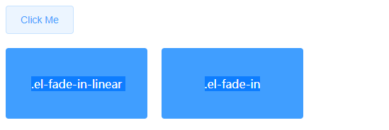
fade 淡入淡出
提供 el-fade-in-linear 和 el-fade-in 两种效果。
<template>
  <div>
    <el-button @click="show = !show">Click Me</el-button>

    <div style="display: flex; margin-top: 20px; height: 100px;">
      <transition name="el-fade-in-linear">
        <div v-show="show" class="transition-box">.el-fade-in-linear</div>
      </transition>
      <transition name="el-fade-in">
        <div v-show="show" class="transition-box">.el-fade-in</div>
      </transition>
    </div>
  </div>
</template>

<script>
    export default {
    data: () => ({
      show: true
    })
  }
</script>

<style>
  .transition-box {
    margin-bottom: 10px;
    width: 200px;
    height: 100px;
    border-radius: 4px;
    background-color: #409EFF;
    text-align: center;
    color: #fff;
    padding: 40px 20px;
    box-sizing: border-box;
    margin-right: 20px;
  }
</style>
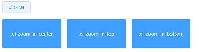
zoom 缩放
提供 el-zoom-in-center,el-zoom-in-top 和 el-zoom-in-bottom 三种效果。
<template>
  <div>
    <el-button @click="show2 = !show2">Click Me</el-button>

    <div style="display: flex; margin-top: 20px; height: 100px;">
      <transition name="el-zoom-in-center">
        <div v-show="show2" class="transition-box">.el-zoom-in-center</div>
      </transition>

      <transition name="el-zoom-in-top">
        <div v-show="show2" class="transition-box">.el-zoom-in-top</div>
      </transition>

      <transition name="el-zoom-in-bottom">
        <div v-show="show2" class="transition-box">.el-zoom-in-bottom</div>
      </transition>
    </div>
  </div>
</template>

<script>
  export default {
    data: () => ({
      show2: true
    })
  }
</script>

<style>
  .transition-box {
    margin-bottom: 10px;
    width: 200px;
    height: 100px;
    border-radius: 4px;
    background-color: #409EFF;
    text-align: center;
    color: #fff;
    padding: 40px 20px;
    box-sizing: border-box;
    margin-right: 20px;
  }
</style>
collapse 展开折叠
使用 el-collapse-transition 组件实现折叠展开效果。

<template>
  <div>
    <el-button @click="show3 = !show3">Click Me</el-button>

    <div style="margin-top: 20px; height: 200px;">
      <el-collapse-transition>
        <div v-show="show3">
          <div class="transition-box">el-collapse-transition</div>
          <div class="transition-box">el-collapse-transition</div>
        </div>
      </el-collapse-transition>
    </div>
  </div>
</template>

<script>
  export default {
    data: () => ({
      show3: true
    })
  }
</script>

<style>
  .transition-box {
    margin-bottom: 10px;
    width: 200px;
    height: 100px;
    border-radius: 4px;
    background-color: #409EFF;
    text-align: center;
    color: #fff;
    padding: 40px 20px;
    box-sizing: border-box;
    margin-right: 20px;
  }
</style>
组件
Layout 布局
通过基础的 24 分栏,迅速简便地创建布局。
基础布局
使用单一分栏创建基础的栅格布局。通过 row 和col 组件,并通过 col 组件的 span 属性我们就可以自由地组合布局。

<el-row>
  <el-col :span="24"><div class="grid-content bg-purple-dark"></div></el-col>
</el-row>
<el-row>
  <el-col :span="12"><div class="grid-content bg-purple"></div></el-col>
  <el-col :span="12"><div class="grid-content bg-purple-light"></div></el-col>
</el-row>
<el-row>
  <el-col :span="8"><div class="grid-content bg-purple"></div></el-col>
  <el-col :span="8"><div class="grid-content bg-purple-light"></div></el-col>
  <el-col :span="8"><div class="grid-content bg-purple"></div></el-col>
</el-row>
<el-row>
  <el-col :span="6"><div class="grid-content bg-purple"></div></el-col>
  <el-col :span="6"><div class="grid-content bg-purple-light"></div></el-col>
  <el-col :span="6"><div class="grid-content bg-purple"></div></el-col>
  <el-col :span="6"><div class="grid-content bg-purple-light"></div></el-col>
</el-row>
<el-row>
  <el-col :span="4"><div class="grid-content bg-purple"></div></el-col>
  <el-col :span="4"><div class="grid-content bg-purple-light"></div></el-col>
  <el-col :span="4"><div class="grid-content bg-purple"></div></el-col>
  <el-col :span="4"><div class="grid-content bg-purple-light"></div></el-col>
  <el-col :span="4"><div class="grid-content bg-purple"></div></el-col>
  <el-col :span="4"><div class="grid-content bg-purple-light"></div></el-col>
</el-row>

<style>
  .el-row {
    margin-bottom: 20px;
    &:last-child {
      margin-bottom: 0;
    }
  }
  .el-col {
    border-radius: 4px;
  }
  .bg-purple-dark {
    background: #99a9bf;
  }
  .bg-purple {
    background: #d3dce6;
  }
  .bg-purple-light {
    background: #e5e9f2;
  }
  .grid-content {
    border-radius: 4px;
    min-height: 36px;
  }
  .row-bg {
    padding: 10px 0;
    background-color: #f9fafc;
  }
</style>
分栏间隔
分栏之间存在间隔。Row 组件 提供 gutter 属性来指定每一栏之间的间隔,默认间隔为 0。

<template>
<el-row :gutter="20">
  <el-col :span="6"><div class="grid-content bg-purple"></div></el-col>
  <el-col :span="6"><div class="grid-content bg-purple"></div></el-col>
  <el-col :span="6"><div class="grid-content bg-purple"></div></el-col>
  <el-col :span="6"><div class="grid-content bg-purple"></div></el-col>
</el-row>
</template>
<style>
  .el-row {
    margin-bottom: 20px;
  &:last-child {
     margin-bottom: 0;
   }
  }
  .el-col {
    border-radius: 4px;
  }
  .bg-purple-dark {
    background: #99a9bf;
  }
  .bg-purple {
    background: #d3dce6;
  }
  .bg-purple-light {
    background: #e5e9f2;
  }
  .grid-content {
    border-radius: 4px;
    min-height: 36px;
  }
  .row-bg {
    padding: 10px 0;
    background-color: #f9fafc;
  }
</style>
混合布局
通过基础的 1/24分栏任意扩展组合形成较为复杂的混合布局。

<template>
  <div id="app">
<el-row :gutter="20">
  <el-col :span="16"><div class="grid-content bg-purple"></div></el-col>
  <el-col :span="8"><div class="grid-content bg-purple"></div></el-col>
</el-row>
<el-row :gutter="20">
  <el-col :span="8"><div class="grid-content bg-purple"></div></el-col>
  <el-col :span="8"><div class="grid-content bg-purple"></div></el-col>
  <el-col :span="4"><div class="grid-content bg-purple"></div></el-col>
  <el-col :span="4"><div class="grid-content bg-purple"></div></el-col>
</el-row>
<el-row :gutter="20">
  <el-col :span="4"><div class="grid-content bg-purple"></div></el-col>
  <el-col :span="16"><div class="grid-content bg-purple"></div></el-col>
  <el-col :span="4"><div class="grid-content bg-purple"></div></el-col>
</el-row>
  </div>
</template>
<style>
  .el-row {
    margin-bottom: 20px;
  &:last-child {
     margin-bottom: 0;
   }
  }
  .el-col {
    border-radius: 4px;
  }
  .bg-purple-dark {
    background: #99a9bf;
  }
  .bg-purple {
    background: #d3dce6;
  }
  .bg-purple-light {
    background: #e5e9f2;
  }
  .grid-content {
    border-radius: 4px;
    min-height: 36px;
  }
  .row-bg {
    padding: 10px 0;
    background-color: #f9fafc;
  }
</style>
分栏偏移
支持偏移指定的栏数。

<template>
  <div id="app">
<el-row :gutter="20">
  <el-col :span="6"><div class="grid-content bg-purple"></div></el-col>
  <el-col :span="6" :offset="6"><div class="grid-content bg-purple"></div></el-col>
</el-row>
<el-row :gutter="20">
  <el-col :span="6" :offset="6"><div class="grid-content bg-purple"></div></el-col>
  <el-col :span="6" :offset="6"><div class="grid-content bg-purple"></div></el-col>
</el-row>
<el-row :gutter="20">
  <el-col :span="12" :offset="6"><div class="grid-content bg-purple"></div></el-col>
</el-row>
  </div>
</template>
<style>
  .el-row {
    margin-bottom: 20px;
  &:last-child {
     margin-bottom: 0;
   }
  }
  .el-col {
    border-radius: 4px;
  }
  .bg-purple-dark {
    background: #99a9bf;
  }
  .bg-purple {
    background: #d3dce6;
  }
  .bg-purple-light {
    background: #e5e9f2;
  }
  .grid-content {
    border-radius: 4px;
    min-height: 36px;
  }
  .row-bg {
    padding: 10px 0;
    background-color: #f9fafc;
  }
</style>
对齐方式
通过 flex 布局来对分栏进行灵活的对齐。

<template>
  <div id="app">
    <el-row type="flex" class="row-bg">
      <el-col :span="6"><div class="grid-content bg-purple"></div></el-col>
      <el-col :span="6"><div class="grid-content bg-purple-light"></div></el-col>
      <el-col :span="6"><div class="grid-content bg-purple"></div></el-col>
    </el-row>
    <el-row type="flex" class="row-bg" justify="center">
      <el-col :span="6"><div class="grid-content bg-purple"></div></el-col>
      <el-col :span="6"><div class="grid-content bg-purple-light"></div></el-col>
      <el-col :span="6"><div class="grid-content bg-purple"></div></el-col>
    </el-row>
    <el-row type="flex" class="row-bg" justify="end">
      <el-col :span="6"><div class="grid-content bg-purple"></div></el-col>
      <el-col :span="6"><div class="grid-content bg-purple-light"></div></el-col>
      <el-col :span="6"><div class="grid-content bg-purple"></div></el-col>
    </el-row>
    <el-row type="flex" class="row-bg" justify="space-between">
      <el-col :span="6"><div class="grid-content bg-purple"></div></el-col>
      <el-col :span="6"><div class="grid-content bg-purple-light"></div></el-col>
      <el-col :span="6"><div class="grid-content bg-purple"></div></el-col>
    </el-row>
    <el-row type="flex" class="row-bg" justify="space-around">
      <el-col :span="6"><div class="grid-content bg-purple"></div></el-col>
      <el-col :span="6"><div class="grid-content bg-purple-light"></div></el-col>
      <el-col :span="6"><div class="grid-content bg-purple"></div></el-col>
    </el-row>
  </div>
</template>

<style>
  .el-row {
    margin-bottom: 20px;
  &:last-child {
     margin-bottom: 0;
   }
  }
  .el-col {
    border-radius: 4px;
  }
  .bg-purple-dark {
    background: #99a9bf;
  }
  .bg-purple {
    background: #d3dce6;
  }
  .bg-purple-light {
    background: #e5e9f2;
  }
  .grid-content {
    border-radius: 4px;
    min-height: 36px;
  }
  .row-bg {
    padding: 10px 0;
    background-color: #f9fafc;
  }
</style>
响应式布局
参照了 Bootstrap 的 响应式设计,预设了五个响应尺寸:xs、sm、md、lg 和 xl。
中大屏设备:

超小型设备:
<template>
  <div id="app">
    <el-row :gutter="10">
      <el-col :xs="8" :sm="6" :md="4" :lg="3" :xl="1"><div class="grid-content bg-purple"></div></el-col>
      <el-col :xs="4" :sm="6" :md="8" :lg="9" :xl="11"><div class="grid-content bg-purple-light"></div></el-col>
      <el-col :xs="4" :sm="6" :md="8" :lg="9" :xl="11"><div class="grid-content bg-purple"></div></el-col>
      <el-col :xs="8" :sm="6" :md="4" :lg="3" :xl="1"><div class="grid-content bg-purple-light"></div></el-col>
    </el-row>
  </div>
</template>

<style>
  .el-col {
    border-radius: 4px;
  }
  .bg-purple-dark {
    background: #99a9bf;
  }
  .bg-purple {
    background: #d3dce6;
  }
  .bg-purple-light {
    background: #e5e9f2;
  }
  .grid-content {
    border-radius: 4px;
    min-height: 36px;
  }
</style>
基于断点的隐藏类
Element 额外提供了一系列类名,用于在某些条件下隐藏元素。这些类名可以添加在任何 DOM 元素或自定义组件上。如果需要,请自行引入以下文件:
import 'element-ui/lib/theme-chalk/display.css';
Row 属性
| 参数 |
说明 |
类型 |
可选值 |
默认值 |
| gutter |
栅格间隔 |
number |
— |
0 |
| type |
布局模式,可选 flex,现代浏览器下有效 |
string |
— |
— |
| justify |
flex 布局下的水平排列方式 |
string |
start/end/center/space-around/space-between |
start |
| align |
flex 布局下的垂直排列方式 |
string |
top/middle/bottom |
top |
| tag |
自定义元素标签 |
string |
* |
div |
Col 属性
| 参数 |
说明 |
类型 |
可选值 |
默认值 |
| span |
栅格占据的列数 |
number |
— |
24 |
| offset |
栅格左侧的间隔格数 |
number |
— |
0 |
| push |
栅格向右移动格数 |
number |
— |
0 |
| pull |
栅格向左移动格数 |
number |
— |
0 |
| xs |
<768px 响应式栅格数或者栅格属性对象 |
number/object (例如: {span: 4, offset: 4}) |
— |
— |
| sm |
≥768px 响应式栅格数或者栅格属性对象 |
number/object (例如: {span: 4, offset: 4}) |
— |
— |
| md |
≥992px 响应式栅格数或者栅格属性对象 |
number/object (例如: {span: 4, offset: 4}) |
— |
— |
| lg |
≥1200px 响应式栅格数或者栅格属性对象 |
number/object (例如: {span: 4, offset: 4}) |
— |
— |
| xl |
≥1920px 响应式栅格数或者栅格属性对象 |
number/object (例如: {span: 4, offset: 4}) |
— |
— |
| tag |
自定义元素标签 |
string |
* |
div |
Container 布局容器
用于布局的容器组件,方便快速搭建页面的基本结构:
<el-container>:外层容器。当子元素中包含<el-header> 或 <el-footer> 时,全部子元素会垂直上下排列,否则会水平左右排列。
<el-header>:顶栏容器。
<el-aside>:侧边栏容器。
<el-main>:主要区域容器。
<el-footer>:底栏容器。
以上组件采用了 flex 布局,使用前请确定目标浏览器是否兼容。此外,<el-container> 的子元素只能是后四者,后四者的父元素也只能是 <el-container>。
常见页面布局

<template>
<div id="app">
<el-container>
  <el-header>Header</el-header>
  <el-main>Main</el-main>
</el-container>

<el-container>
  <el-header>Header</el-header>
  <el-main>Main</el-main>
  <el-footer>Footer</el-footer>
</el-container>

<el-container>
  <el-aside width="200px">Aside</el-aside>
  <el-main>Main</el-main>
</el-container>

<el-container>
  <el-header>Header</el-header>
  <el-container>
    <el-aside width="200px">Aside</el-aside>
    <el-main>Main</el-main>
  </el-container>
</el-container>

<el-container>
  <el-header>Header</el-header>
  <el-container>
    <el-aside width="200px">Aside</el-aside>
    <el-container>
      <el-main>Main</el-main>
      <el-footer>Footer</el-footer>
    </el-container>
  </el-container>
</el-container>

<el-container>
  <el-aside width="200px">Aside</el-aside>
  <el-container>
    <el-header>Header</el-header>
    <el-main>Main</el-main>
  </el-container>
</el-container>

<el-container>
  <el-aside width="200px">Aside</el-aside>
  <el-container>
    <el-header>Header</el-header>
    <el-main>Main</el-main>
    <el-footer>Footer</el-footer>
  </el-container>
</el-container>
</div>
</template>
<style>
  .el-header, .el-footer {
    background-color: #B3C0D1;
    color: #333;
    text-align: center;
    line-height: 60px;
  }

  .el-aside {
    background-color: #D3DCE6;
    color: #333;
    text-align: center;
    line-height: 200px;
  }

  .el-main {
    background-color: #E9EEF3;
    color: #333;
    text-align: center;
    line-height: 160px;
  }

  body > .el-container {
    margin-bottom: 40px;
  }

  .el-container:nth-child(5) .el-aside,
  .el-container:nth-child(6) .el-aside {
    line-height: 260px;
  }

  .el-container:nth-child(7) .el-aside {
    line-height: 320px;
  }
</style>
Container 属性
| 参数 |
说明 |
类型 |
可选值 |
默认值 |
| direction |
子元素的排列方向 |
string |
horizontal / vertical |
子元素中有 el-header 或 el-footer 时为 vertical,否则为 horizontal
|
Header属性
| 参数 |
说明 |
类型 |
可选值 |
默认值 |
| height |
顶栏高度 |
string |
— |
60px |
Aside 属性
| 参数 |
说明 |
类型 |
可选值 |
默认值 |
| width |
侧边栏宽度 |
string |
— |
300px |
Footer 属性
| 参数 |
说明 |
类型 |
可选值 |
默认值 |
| height |
底栏高度 |
string |
— |
60px |
Color 色彩
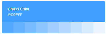
Element 为了避免视觉传达差异,使用一套特定的调色板来规定颜色,为你所搭建的产品提供一致的外观视觉感受。
主色
Element 主要品牌颜色是鲜艳、友好的蓝色。
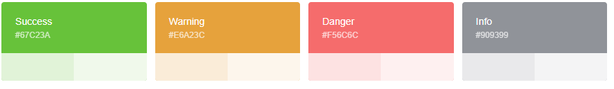
辅助色
除了主色外的场景色,需要在不同的场景中使用(例如危险色表示危险的操作)。
中性色
中性色用于文本、背景和边框颜色。通过运用不同的中性色,来表现层次结构。

Typography 字体
字号
| 层级 |
字体大小 |
举例 |
| 辅助文字 |
12px Extra Small |
用 Element 快速搭建页面 |
| 正文(小) |
13px Small |
用 Element 快速搭建页面 |
| 正文 |
14px Base |
用 Element 快速搭建页面 |
| 小标题 |
16px Medium |
用 Element 快速搭建页面 |
| 标题 |
18px large |
用 Element 快速搭建页面 |
| 主标题 |
20px Extra large |
用 Element 快速搭建页面 |
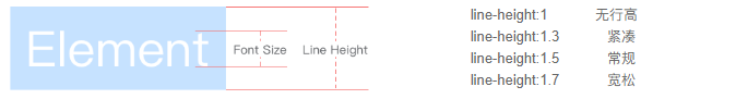
行高
Font-family
font-family: "Helvetica Neue",Helvetica,"PingFang SC","Hiragino Sans GB","Microsoft YaHei","微软雅黑",Arial,sans-serif;
Border 边框
element-ui对边框进行统一规范,可用于按钮、卡片、弹窗等组件里
边框
主要有:1.虚实线类型 2.粗细
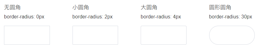
圆角
###投影

Icon 图标
提供了一套常用的图标集合。
使用方法
直接通过设置类名为 el-icon-iconName 来使用即可。例如:
<template>
<div id="app">
  <i class="el-icon-share"></i>
  <el-button type="primary" icon="el-icon-search">搜索</el-button>
  <el-button type="success" icon="el-icon-share">分享</el-button>
  <el-button type="danger" icon="el-icon-delete">删除</el-button>
  <el-button type="warning" icon="el-icon-edit">编辑</el-button>
</div>
</template>

图标集合
这里可以上官网查看图标集合
Button 按钮
使用type、plain、round和circle属性来定义 Button 的样式。

<template>
  <div id="app">
    <el-row>
      <el-button>默认按钮</el-button>
      <el-button type="primary">主要按钮</el-button>
      <el-button type="success">成功按钮</el-button>
      <el-button type="info">信息按钮</el-button>
      <el-button type="warning">警告按钮</el-button>
      <el-button type="danger">危险按钮</el-button>
    </el-row>

    <el-row>
      <el-button plain>朴素按钮</el-button>
      <el-button type="primary" plain>主要按钮</el-button>
      <el-button type="success" plain>成功按钮</el-button>
      <el-button type="info" plain>信息按钮</el-button>
      <el-button type="warning" plain>警告按钮</el-button>
      <el-button type="danger" plain>危险按钮</el-button>
    </el-row>

    <el-row>
      <el-button round>圆角按钮</el-button>
      <el-button type="primary" round>主要按钮</el-button>
      <el-button type="success" round>成功按钮</el-button>
      <el-button type="info" round>信息按钮</el-button>
      <el-button type="warning" round>警告按钮</el-button>
      <el-button type="danger" round>危险按钮</el-button>
    </el-row>

    <el-row>
      <el-button icon="el-icon-search" circle></el-button>
      <el-button type="primary" icon="el-icon-edit" circle></el-button>
      <el-button type="success" icon="el-icon-check" circle></el-button>
      <el-button type="info" icon="el-icon-message" circle></el-button>
      <el-button type="warning" icon="el-icon-star-off" circle></el-button>
      <el-button type="danger" icon="el-icon-delete" circle></el-button>
    </el-row>
  </div>
</template>
可以使用disabled属性来定义按钮是否可用,它接受一个Boolean值
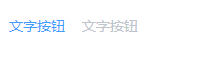
文字按钮
没有边框和背景色的按钮。
<template>
  <div id="app">
    <el-button type="text">文字按钮</el-button>
    <el-button type="text" disabled>文字按钮</el-button>
  </div>
</template>
图标按钮
带图标的按钮可增强辨识度(有文字)或节省空间(无文字)。
设置icon属性即可,icon 的列表可以参考 Element 的 icon 组件,也可以设置在文字右边的 icon ,只要使用i标签即可,可以使用自定义图标。
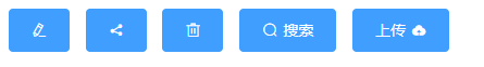
<template>
  <div id="app">
    <el-button type="primary" icon="el-icon-edit"></el-button>
    <el-button type="primary" icon="el-icon-share"></el-button>
    <el-button type="primary" icon="el-icon-delete"></el-button>
    <el-button type="primary" icon="el-icon-search">搜索</el-button>
    <el-button type="primary">上传<i class="el-icon-upload el-icon--right"></i></el-button>
  </div>
</template>
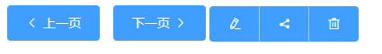
按钮组
以按钮组的方式出现 ,使用<el-button-group>标签来嵌套按钮 ,常用于多项类似操作
<template>
  <div id="app">
    <el-button type="primary" icon="el-icon-arrow-left">上一页</el-button>
    <el-button type="primary">下一页<i class="el-icon-arrow-right el-icon--right"></i></el-button>
    </el-button-group>
    <el-button-group>
      <el-button type="primary" icon="el-icon-edit"></el-button>
      <el-button type="primary" icon="el-icon-share"></el-button>
      <el-button type="primary" icon="el-icon-delete"></el-button>
    </el-button-group>
  </div>
</template>
加载中
点击按钮后进行数据加载操作,在按钮上显示加载状态。
要设置为loading状态,只要设置loading属性为true即可。

<el-button type="primary" :loading="true">加载中</el-button>
不同尺寸
Button 组件提供除了默认值以外的三种尺寸,可以在不同场景下选择合适的按钮尺寸。
通过设置size属性(medium、small、mini)来配置它们。
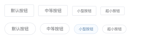
<el-row>
  <el-button>默认按钮</el-button>
  <el-button size="medium">中等按钮</el-button>
  <el-button size="small">小型按钮</el-button>
  <el-button size="mini">超小按钮</el-button>
</el-row>
<el-row>
  <el-button round>默认按钮</el-button>
  <el-button size="medium" round>中等按钮</el-button>
  <el-button size="small" round>小型按钮</el-button>
  <el-button size="mini" round>超小按钮</el-button>
</el-row>
属性
| 参数 |
说明 |
类型 |
可选值 |
默认值 |
| size |
尺寸 |
string |
medium / small / mini |
— |
| type |
类型 |
string |
primary / success / warning / danger / info / text |
— |
| plain |
是否朴素按钮 |
boolean |
— |
false |
| round |
是否圆角按钮 |
boolean |
— |
false |
| circle |
是否圆形按钮 |
boolean |
— |
false |
| loading |
是否加载中状态 |
boolean |
— |
false |
| disabled |
是否禁用状态 |
boolean |
— |
false |
| icon |
图标类名 |
string |
— |
— |
| autofocus |
是否默认聚焦 |
boolean |
— |
false |
| native-type |
原生type 属性 |
string |
button / submit / reset |
button |
详细开发文档请上Element-UI官网查看