seaborn(一)——可视化统计量间的关系(relationship)
seaborn关注的是统计量之间的关系。
x,y一般为数值型数据,关注两个数值变量之间的关系
可以绘制出曲线图和散点图
sns.relplot()
- relplot():
- sns.replot(kind=“scatter”),相当于scatterplot() 用来绘制散点图
- sns.replot(kind=“line”),相当于lineplot() 用来绘制曲线图
本例中,我们的数据集采用库自带的小费数据集tips。
tips小费数据集:
是一个餐厅服务员收集的小费数据集,包含了7个变量:
总账单、小费、顾客性别、是否吸烟、日期、吃饭时间、顾客人数
import matplotlib.pyplot as plt
import seaborn as sns
import pandas as pd
import numpy as np

tips= sns.load_dataset("tips")
tips.head()
|
total_bill |
tip |
sex |
smoker |
day |
time |
size |
| 0 |
16.99 |
1.01 |
Female |
No |
Sun |
Dinner |
2 |
| 1 |
10.34 |
1.66 |
Male |
No |
Sun |
Dinner |
3 |
| 2 |
21.01 |
3.50 |
Male |
No |
Sun |
Dinner |
3 |
| 3 |
23.68 |
3.31 |
Male |
No |
Sun |
Dinner |
2 |
| 4 |
24.59 |
3.61 |
Female |
No |
Sun |
Dinner |
4 |
tips.dtypes
total_bill     float64
tip            float64
sex           category
smoker        category
day           category
time          category
size             int64
dtype: object
replot常用参数
x: x轴
y: y轴
hue: 在某一维度上,用颜色区分
style: 在某一维度上, 用线的不同表现形式区分, 如 点线, 虚线等
size: 控制数据点大小或者线条粗细
col: 列上的子图
row: 行上的子图
kind: kind= ‘scatter’(默认值)
kind='line’时候,可以通过参数ci:(confidence interval)参数,来控制阴影部分,如,ci=‘sd’ (一个x有多个y值)
也可以关闭数据聚合功能(urn off aggregation altogether), 设置estimator=None即可
data
以下,结合具体使用效果来理解一下。
一、散点图:relplot(kind=“scatter”)
replot出的图默认为散点图。
sns.relplot(x='total_bill', y='tip', data=tips)
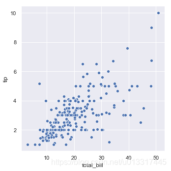
可视化后,可以看出:
给的小费大小集中在[0,6]
账单集中在[7,36]
可以看出,消费高的小费多。
参数hue
hue
用不同的颜色区分出来
在smoker维度,smoker:取值有:No、Yes 蓝yes橙no
sns.relplot(x='total_bill', y='tip', data=tips, hue='smoker')
<seaborn.axisgrid.FacetGrid at 0x392c25f8>
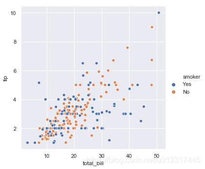
图上有3个维度的信息:
total_bill(x)、tip(y)、smoker(不同颜色)
hue+ hue_order
可以通过hue_order(一个list)来控制图例中hue的顺序。如果不设置的话,就会自动根据data来进行设定。
如果hue是数字型连续值,hue_order就没有什么关系了。
hue+palette
palette自定义颜色范围
set(tips.day) #    {'Fri', 'Sat', 'Sun', 'Thur'}
sns.relplot(x='total_bill', y='tip',  data=tips, hue='day')
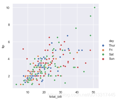
sns.relplot(x='total_bill', y='tip', data=tips, hue="day", palette="ch:r=-.5,l=.75")
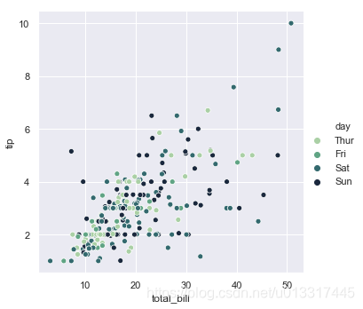
跟哪天吃饭好像没什么关系,看不出来一个渐变色的走势。
参数style
style
不同的表示形状上区分
性别维度上,不同的性别, 原点:Male 叉叉:Female
sns.relplot(x='total_bill', y='tip', data=tips, style='sex')
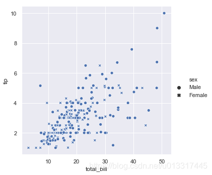
图上有3个维度的信息:
total_bill、tip、sex
x、y、不同形状
可以看出,给小费的男性多,男性给的小费高一点,是不是?你还可以看出来什么信息呢?
hue+style
hue+style
抽烟的女性:蓝色+叉叉
抽烟的男性:蓝色+原点
不抽烟的女性:橘色+叉叉
不抽烟的男性:橘色+原点
sns.relplot(x='total_bill', y='tip', data=tips, hue='smoker', style='sex')
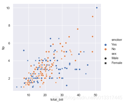
图上有4个维度的信息了:
total_bill、tip、smoker、sex
x、y、不同颜色、不同形状
看出了什么?
给高小费的(超过5的),竟然大都是不抽烟的男性(橘色+原点)
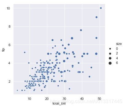
参数size
控制点的大小或者线条粗细
巧妙引入size维度(顾客人数)信息
sns.relplot(x='total_bill', y='tip', data=tips, hue='smoker', style='sex', size='size')
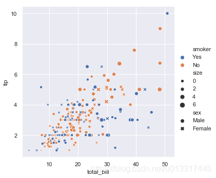
图上有5个维度的信息了
图上可以看出,人多消费大,消费大小费高
你还看出了什么呢?
展示的信息量太多了,太丰富了,这个图反而太复杂而让我们不好解析它了
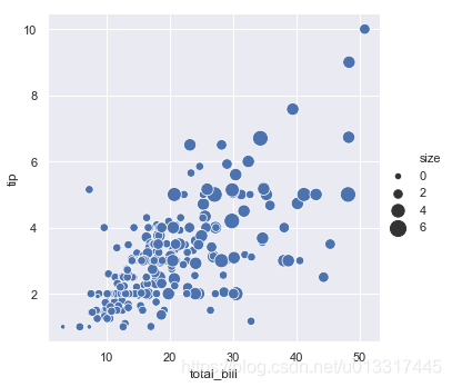
sns.relplot(x='total_bill', y='tip', data=tips,size='size')

set(tips['size'])#size的取值(顾客数)有:1,2,3,4,5,6人
size+sizes
如用size=(20,200)控制size的范围
sns.relplot(x='total_bill', y='tip', data=tips, size="size", sizes=(20, 200))
二、曲线图:relplot(kind=“line”)
数据集为fmri
fmri= sns.load_dataset("fmri")
fmri.head()
|
subject |
timepoint |
event |
region |
signal |
| 0 |
s13 |
18 |
stim |
parietal |
-0.017552 |
| 1 |
s5 |
14 |
stim |
parietal |
-0.080883 |
| 2 |
s12 |
18 |
stim |
parietal |
-0.081033 |
| 3 |
s11 |
18 |
stim |
parietal |
-0.046134 |
| 4 |
s10 |
18 |
stim |
parietal |
-0.037970 |
fmri.dtypes
subject       object
timepoint      int64
event         object
region        object
signal       float64
dtype: object
set(fmri.region)  #    {'frontal', 'parietal'}

#如何将object转成category类型:
fmri['region']=fmri['region'].astype('category')

fmri.region.dtype
CategoricalDtype(categories=[u'frontal', u'parietal'], ordered=False)
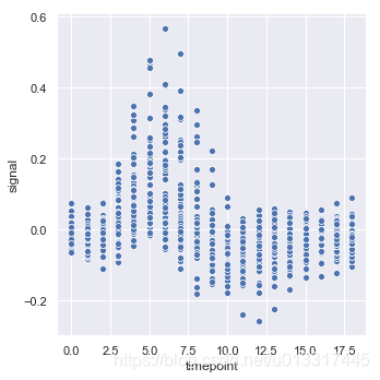
先用散点图看一下它的数据分布情况:
sns.relplot(x="timepoint", y="signal", data=fmri)
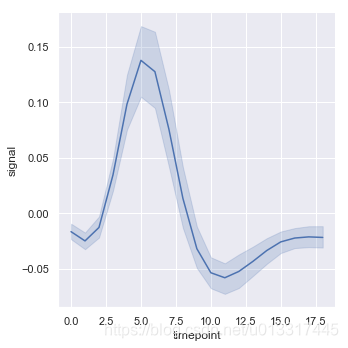
kind=“line”
kind=“line” 就是lineplot()
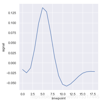
一个x有多个y,怎么聚合呢?默认的是aggregate the multiple measurements at each x value by plotting the mean and the 95% confidence interval around the mean:
sns.relplot(x="timepoint", y="signal", data=fmri, kind="line")
ci=None 控制不显示聚合的阴影
sns.relplot(x="timepoint", y="signal", data=fmri, kind="line", ci=None)
ci=“sd” 控制聚合的算法
sns.relplot(x="timepoint", y="signal", data=fmri, kind="line", ci="sd")

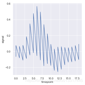
关闭聚合:estimator= None
展示其数据最原始的情形,“曲线版的散点图”:
sns.relplot(x="timepoint", y="signal", data=fmri, kind="line",estimator=None)
hue:利用颜色区分
sns.relplot(x="timepoint", y="signal", data=fmri, kind="line",hue="event")

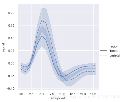
style:利用形状区分
sns.relplot(x="timepoint", y="signal", style="region", kind="line", data=fmri)
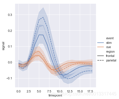
hue+ style
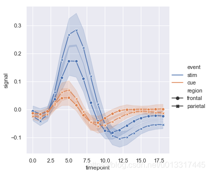
sns.relplot(x="timepoint", y="signal", hue="event", style="region", kind="line", data=fmri)
style结合dashes+markers可设置不同分类的标记样式
sns.relplot(x="timepoint", y="signal", hue="event", style="region", kind="line", dashes=False, markers=True, data=fmri)
units: ??我没有明白这个
当有多次的采样单位时,可以单独绘制每个采样单位,而无需通过语义区分它们。这可以避免使图例混乱。
说了这么多还是没有明白。。。。。
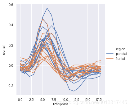
set(fmri.subject)
sns.relplot(kind="line",data=fmri.query("event=='stim'"), x="timepoint", y="signal", hue="region", units="subject",estimator=None)
lineplot色调和图例的处理还取决于hue是分类型数据or连续型数据
hue为连续型数值
dots= sns.load_dataset("dots").query("align== 'dots'")
print(dots.head())
print(dots.dtypes)
  align choice  time  coherence  firing_rate
0  dots     T1   -80        0.0    33.189967
1  dots     T1   -80        3.2    31.691726
2  dots     T1   -80        6.4    34.279840
3  dots     T1   -80       12.8    32.631874
4  dots     T1   -80       25.6    35.060487
align           object
choice          object
time             int64
coherence      float64
firing_rate    float64
dtype: object
相关性coherence是连续型数值
看看图例看看颜色:
颜色越重的相关性越强
sns.relplot(x="time", y="firing_rate", hue="coherence", style="choice", kind="line", data=dots)
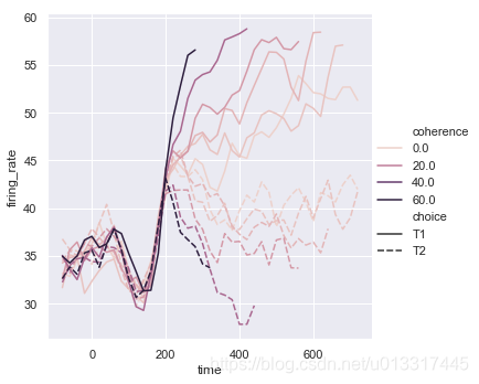
size: 可用来控制线条宽度
也可以用size表达coherence
相关性越大,线条越粗
sns.relplot(x="time", y="firing_rate", size="coherence", style="choice", kind="line", data=dots)

用date数据画图
data.head()
|
date |
date_block_num |
shop_id |
item_id |
item_price |
item_cnt_day |
| 0 |
2013-01-02 |
0 |
59 |
22154 |
999.00 |
1.0 |
| 1 |
2013-01-03 |
0 |
25 |
2552 |
899.00 |
1.0 |
| 2 |
2013-01-05 |
0 |
25 |
2552 |
899.00 |
-1.0 |
| 3 |
2013-01-06 |
0 |
25 |
2554 |
1709.05 |
1.0 |
| 4 |
2013-01-15 |
0 |
25 |
2555 |
1099.00 |
1.0 |
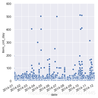
seaborn结合matplotlib的xlim()和ylim()设置坐标范围
g= sns.relplot(x="date", y="item_cnt_day", data=data)

#设置x轴 y轴范围:
plt.xlim("2014-01","2014-12")
plt.ylim(0,600)
#设置x轴 y轴刻度:
#plt.xticks=

g.fig.autofmt_xdate()#日期的排列根据图像的大小自适应
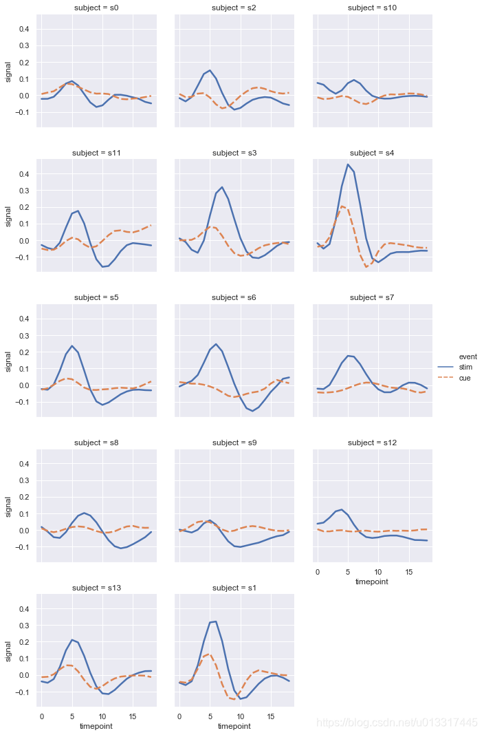
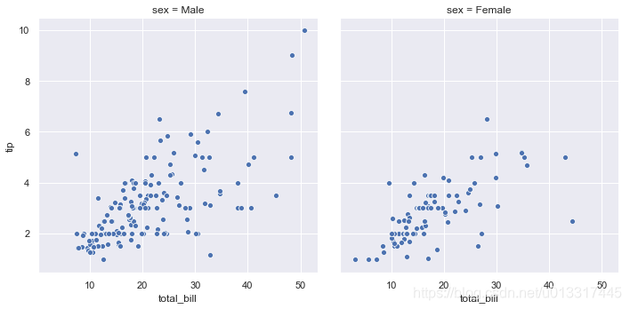
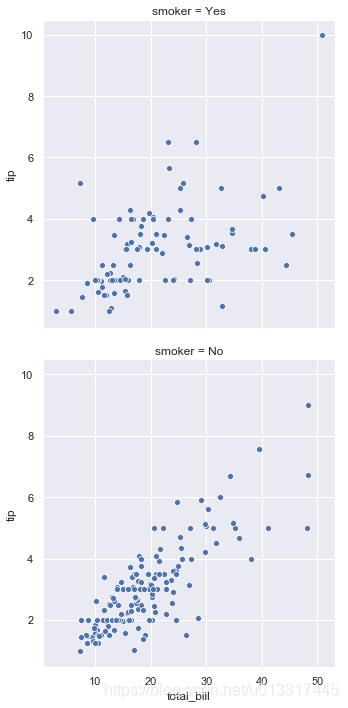
三、使用子图展示多重关系
参数col、row可以帮助我们实现。
col=“sex” 有几种sex,就有几列图(2种male和female,2列图)
row=“smoker” 有几种smoker,就有几行图
col=“subject”, col_wrap=3 subject特别多,可以控制显示的图片的行数
sns.relplot(x="total_bill", y="tip", col="sex", data=tips)
sns.relplot(x="total_bill", y="tip", row="smoker", data=tips)
sns.relplot(x="total_bill", y="tip", row="smoker", col="sex", data=tips)

sns.relplot(x="timepoint", y="signal",
            hue="event", style="event",
            col="subject", col_wrap=3,
            data=fmri.query("region=='frontal'"),
            kind="line",
            linewidth=2.5,
            aspect=1, #长宽比,该值越大图片越方
            height=3)