ExtJS是构建浏览器应用界面的框架,为开发人员提供了丰富UI组件,这些组件在页面中是以特定方式排列的,即布局方式。
一个ExtJS构建的页面,无论看起来多么复杂,最终都能根据其布局拆分成许多小的区域。
最近工作中的项目比较老旧,使用的是3.0版本的 ExtJS(最新版为6.0)。工作需要,此处稍微整理ExtJS 3.0中的几种布局,高版本中可能提供了更多布局类型。
ExtJS版本:3.0
关于资料:建议下载ExtJS 3.0 api 文档。
一、ExtJS 3.0布局类型概览
根据API文档,所有布局类型及之间的关系如下:
层级表示布局的继承关系,基础布局为ContainerLayout
ContainerLayout
————1、AnchorLayout
————————1.1、AbsoluteLayout
————————1.2、FormLayout
————2、FitLayout
————————2.1、CardLayout
————3、BorderLayout
————————BorderLayout.Regin、BorderLayout.SplitRegion
————4、BoxLayout
————————4.1、HBoxLayout
————————4.2、VBoxLayout
————5、ColumnLayout
————6、MenuLayout
————7、TableLayout
————8、ToolbarLayout
二、布局说明及实践
以下是本次学习的基础代码:
<!DOCTYPE html>
<html lang="en">
<head>
    <meta charset="UTF-8">
    <title>Title</title>
    <link rel="stylesheet" href="./extjs3/resources/css/ext-all.css" />
    <script src="./extjs3/adapter/ext/ext-base.js"></script>
    <script src="./extjs3/ext-all.js"></script>
    <script>
    Ext.onReady(function() {
        //此处编写测试代码

    });
    </script>
</head>
<body>
</body>
</html>
1、ContainerLayout 容器布局
ContainerLayout是其它布局类的父类,它提供了基础性的逻辑。在Ext中,它只是把子元件负责渲染到容器中去,与大小尺寸和定位等的功能没有关系。应通过继承该类的方式使用,一般很少通过关键字new直接使用。容器没有指定布局方式(通过layout配置项指定)时,默认采用此布局。
测试代码:
let container = new Ext.Panel({
    //指定renderTo配置项,则直接渲染到页面,否则需调用组件的render()方法。若此组件包含于其他容器,则不应该指定此项
    renderTo: Ext.getBody(),
    html: "这是容器内容"
});
//或者:
let container = new Ext.Panel({
    html: "这是容器内容"
});
container.render(document.getElementsByTagName("body")[0])
渲染效果:

2、AnchorLayout 锚定布局
继承于ContainerLayout,特点是子组件能根据其设置的锚定值,自动调整其相对于容器的右边距及高度。此布局对应layout值为“anchor”。
测试代码:
//此处使用Viewport组件,其特点是自动填满整个浏览器页面可视区域
var viewport = new Ext.Viewport({
    layout: 'anchor',
    items: [{
        title: 'Item 1',
        html: 'Content 1',
        //right即直至容器最右边,即宽度占满。高度为父容器20%
        anchor: 'right 20%'
    }, {
        title: 'Item 2',
        html: 'Content 2',
        //宽高分别占父容器50%,30%
        anchor: '50% 30%'
    }, {
        title: 'Item 3',
        html: 'Content 3',
        //宽距父容器右边100像素,高度为50%
        anchor: '-100 50%'
    }]
});
渲染效果(调整浏览器窗口大小,子组件宽高即时自动调整):
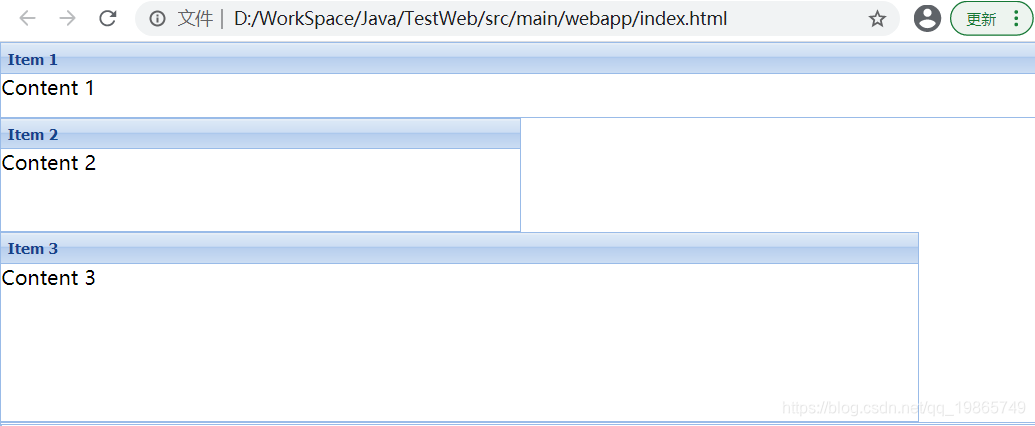
锚定规则anchor说明:
格式:'宽值 高值',高值可省略。其中宽值可有三种格式:right(或r)、百分比、固定值(表示右边距),高值只能为百分比。
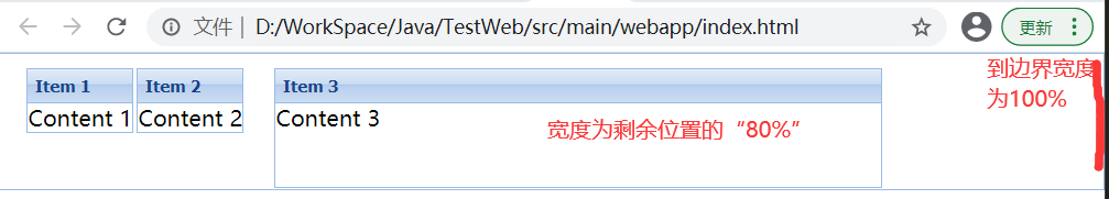
3、AbsoluteLayout 绝对布局
继承于AnchorLayout,相对很好理解,通过指定x、y轴值指定绝对定位位置。需要注意的是,因为继承于AnchorLayout,所以子组件可通过anchor指定其相对宽度(此布局中比较特殊)与高度。此布局对应layout值为“absolute”。
测试代码:
var panel = new Ext.Panel({
    renderTo: Ext.getBody(),
    layout: 'absolute',
    height: 100,
    items: [{
        title: 'Item 1',
        html: 'Content 1',
        x: 20,
        y: 10
    }, {
        title: 'Item 2',
        html: 'Content 2',
        x: 100,
        y: 10
    }, {
        title: 'Item 3',
        html: 'Content 3',
        x: 200,
        y: 10,
        //通过锚定规则指定此组件宽度,此处宽度百分比将是相对于剩下宽度的百分比(实践发现此处值也并非线性变化的)!
        anchor: "80%"
    }]
});
渲染效果:
4、FormLayout 表单布局
继承于AnchorLayout,里面可包含各种表单组件,每个表单组件(包含标签部分与输入部分)独占一行。此布局对应layout值为“form”。
测试代码:
//此处建议直接使用Ext.form.FormPanel 组件,FormPanel已经是表单布局
var form = new Ext.Panel({
    renderTo: Ext.getBody(),
    labelWidth: 75,
    layout: "form",
    title: 'Form Layout',
    bodyStyle: 'padding:15px',
    width: 350,
    labelPad: 10,
    //指定包含组件的默认类型(xtype)
    defaultType: 'textfield',
    defaults: {
        // 应用于每个被包含的项
        width: 230,
        msgTarget: 'side'
    },
    layoutConfig: {
        // 这里是布局配置项
        labelSeparator: ''
    },
    items: [{
        id: "testFiled",
        fieldLabel: 'First Name',
        name: 'first',
        allowBlank: false,
    }, {
        fieldLabel: 'Last Name',
        name: 'last'
    }, {
        fieldLabel: 'Company',
        name: 'company'
    }, {
        fieldLabel: 'Email',
        name: 'email',
        vtype: 'email'
    }],
    buttons: [{
        text: 'Save',
        onClick: function() {
            console.log(Ext.getCmp("testFiled").getXType());
        }
    }, {
        text: 'Cancel'
    }]
});
渲染效果:

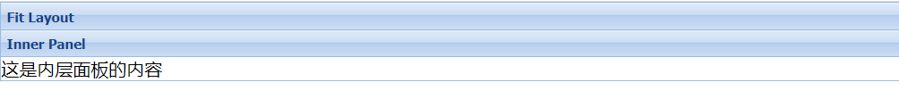
5、FitLayout 适应布局
继承于CotainerLayout布局,此布局类为仅包含单个组件的基础类,布局内组件会自动展开以填满容器。此布局对应layout值为“fit”。
测试代码:
var p = new Ext.Panel({
    renderTo: Ext.getBody(),
    title: 'Fit Layout',
    layout: 'fit',
    //注意items值直接为组件对象,而非组件数组。若写组件数组,也仅有第一个组件会生效
    items: {
        title: '内层面板',
        title: 'Inner Panel',
        html: '<p>这是内层面板的内容</p>',
        border: false
    }
});
渲染效果:
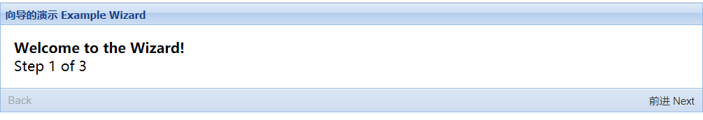
6、CardLayout 卡片布局
继承于FitLayout。前面所述,FitLayout布局内仅能包含一个组件,准确地说,是FitLayout仅能展示一个组件,对于创建FitLayout布局容器时,传入多个组件也不会报错,但仅仅是第一个组件会被渲染。
CardLayout 一次也仅能展示一个组件,但其可包含多个组件,多个组件以卡片方式重叠,可通过组件方法控制需展示的具体组件。
测试代码:
//切换逻辑,参数:1为前进,-1为后退
var navHandler = function(direction) {
    //通过卡片布局的方法setActiveItem(String/Number item) 设置激活的卡片,参数为卡片索引或卡片ID
    let comp = Ext.getCmp("cardPanel");
    let layout = comp.layout;
    let btnPrev = Ext.getCmp("move-prev");
    let btnNext = Ext.getCmp("move-next");
    curCardIndex += direction;
    layout.setActiveItem(curCardIndex);
    if (curCardIndex == cardNum - 1) {
        btnNext.setDisabled(true);
    } else {
        btnNext.setDisabled(false);
    }
    if (curCardIndex == 0) {
        btnPrev.setDisabled(true);
    } else {
        btnPrev.setDisabled(false);
    }
};

let cardNum = 3;
let curCardIndex = 0;
var card = new Ext.Panel({
    renderTo: Ext.getBody(),
    id: "cardPanel",
    title: '向导的演示 Example Wizard',
    layout: 'card',
    // 默认激活的item不能缺少。从0开始
    activeItem: 0,
    bodyStyle: 'padding:15px',
    //定义包含组件的默认属性
    defaults: {
        border: false
    },
    // 简单的导航按钮,可以扩展更多
    bbar: [{
            id: 'move-prev',
            text: '后退',
            text: 'Back',
            handler: navHandler.createDelegate(this, [-1]),
            disabled: true
        },
        '->', // 表示会占据所有空白的区域
        {
            id: 'move-next',
            text: '前进 Next',
            handler: navHandler.createDelegate(this, [1])
        }
    ],
    // 内面的面板,就是“卡片”
    items: [{
        id: 'card-0',
        html: '<h1>Welcome to the Wizard!</h1><p>Step 1 of 3</p>'
    }, {
        id: 'card-1',
        html: '<p>Step 2 of 3</p>'
    }, {
        id: 'card-2',
        html: '祝贺!Step 3 of 3 - 完成!<h1>Congratulations!</h1><p>Step 3 of 3 - Complete</p>'
    }]
});
渲染效果:
7、BorderLayout 边界布局
继承于ContainerLayout,对应布局属性layout值为“border”。此布局按区域将容器分为东西南北中5块,且提供丰富的配置用于控制每个区域的伸缩、折叠、边框等。
测试代码:
var border = new Ext.Viewport({
    renderTo: Ext.getBody(),
    title: 'Border布局Border Layout',
    layout: 'border',
    height: 500,
    items: [{
        title: '北部面板 North Panel',
        region: 'north',
        //定义初始高度
        height: 100,
        //定义最大最小尺寸(包含面板标题部分。对于北部,即高度)
        minSize: 50,
        maxSize: 200,
        //定义此区域外边距(若两相邻区域紧挨的边界margin都定义为0,则看起来将是一条线,如此列中西部与中部的边界)
        margins: '0 5 5 5',
        //定义此区域是否允许拖动以改变大小,默认false
        split: true,
        //定义此区域是否采用窗口样式,默认false
        frame: true,
        //定义是否可以折叠,默认false
        collapsible: true,
        //定义border是否展示,默认true
        border: false,
    }, {
        title: '南部面板South Panel',
        region: 'south',
        height: 100,
        minSize: 75,
        maxSize: 250,
    }, {
        title: '西部面板West Panel',
        region: 'west',
        margins: '5 0 0 5',
        // cmargins: '5 5 0 5', 此项不太了解
        width: 200,
        minSize: 100,
        maxSize: 300
    }, {
        title: '东面板East Panel',
        region: 'east',
        margins: '5 0 0 5',
        width: 200,
        minSize: 100,
        maxSize: 300
    }, {
        title: '主面板Main Content',
        region: 'center',
        margins: '5 5 0 0'
    }]
});
渲染效果:
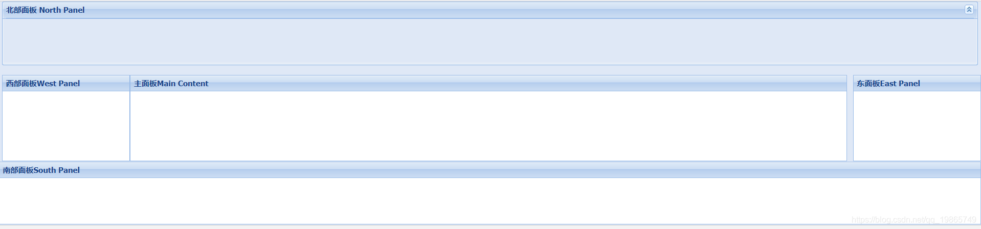
BorderLayout各区域容器:
border布局的各区域对应的容器为Ext.layout.BorderLayout.Region 或Ext.layout.BorderLayout.SplitRegion类,此例中,各区域的配置项即为此2类的配置项,具体为哪一类,暂不是很清楚。
8、BoxLayout 盒子布局
继承于ContainerLayout,也为HBoxLayout、VBoxLayout的基础类,通常不应直接使用,故此处不实践。
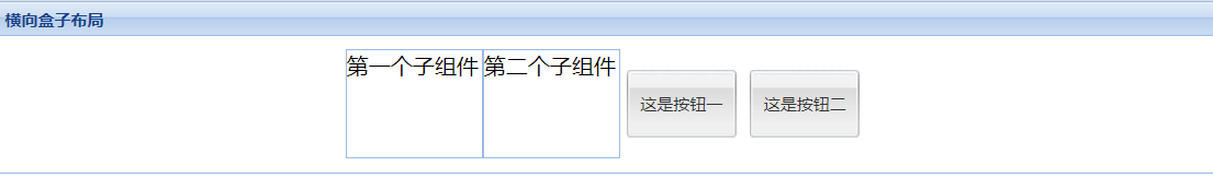
9、HBoxLayout 横向盒子布局
水平放置其组件,此布局对应布局属性layout值为“hbox”。在需要水平方向排列组件的场景,如一行放置多个工具按钮,此布局比绝对布局有很大优势。
测试代码:
let panel = new Ext.Panel({
    renderTo: Ext.getBody(),
    title: '横向盒子布局',
    layout: 'hbox',
    //设置自适应高度
    autoHeight: true,
    //布局特定的配置需写在layoutConfig 中
    layoutConfig: {
        //对齐方式:top(默认)、middle、stretch(组件被垂直拉伸以填满容器高度)、stretchmax
        align: "middle",
        //组件被包装的位置(即整体放置位置),选项:start(左边,默认)、center(中间)、end(右边)
        pack: "center",
        //flex : 10
        //组件未指定外边距时,使用此默认外边距。暂时没实践成功(添加后渲染不出)!!!
        //defaultMargins : "0 5 0",
        //指定此布局的内边距
        padding: 10,
    },
    items: [{
        height: 80,
        width: 100,
        html: "第一个子组件"
    }, {
        height: 80,
        width: 100,
        html: "第二个子组件"
    }, {
        xtype: "button",
        text: "这是按钮一",
        height: 50,
        width: 80,
        margins: "0 5 0",
        flex: 1
    }, {
        xtype: "button",
        text: "这是按钮二",
        height: 50,
        width: 80,
        flex: 2,
        margins: "0 5 0"
    }]
});
渲染效果:
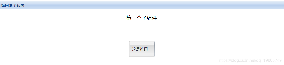
10、VBoxLayout 纵向盒子布局
纵向放置其组件,layout对应值为“vbox”。类似HBoxLayout布局类,仅几个定义属性取值或含义相应调整如下:
algin取值:left、center、stretch、stretchmax;
pack取值含义:start-上部,center-中部,end-底部。
测试代码:
let panel = new Ext.Panel({
            renderTo: Ext.getBody(),
            title: '纵向盒子布局',
            layout: 'vbox',
            //纵向盒子布局,必须指定高度,使用autoHeight无效!
            height: 200,
            //布局特定的配置需写在layoutConfig 中
            layoutConfig: {
                align: "center",
                pack: "center",
                padding: 10,
            },
            items: [{
                height: 80,
                width: 100,
                html: "第一个子组件"
            }, {
                xtype: "button",
                text: "这是按钮一",
                height: 50,
                width: 80,
                margins: "5 0",
                flex: 1
            }]
        });
渲染效果:
11、ColumnLayout 列布局
继承于ContainerLayout,用于构建多列结构的布局,各列可指定固定或百分比宽度,布局高度根据内容自适应。此布局对应布局属性layout值为“column”。
测试代码:
var p = new Ext.Panel({
    renderTo: Ext.getBody(),
    title: '列布局 - 百分比Only',
    layout: 'column',
    items: [{
        title: '列一',
        //指定列宽占25%,只能用浮点数值!
        columnWidth: .25,
    }, {
        title: '列二',
        columnWidth: 0.6,
        items: [{
            html: "列二组件1",
            height: 50
        }, {
            html: "列二组件2",
            height: 100
        }]
    }, {
        title: '列三',
        columnWidth: .15
    }]
});
渲染效果:
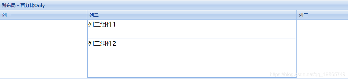
说明:VBoxLayout是纵向盒子布局,一个布局只能实现单列,而列布局可以轻松实现多列布局。
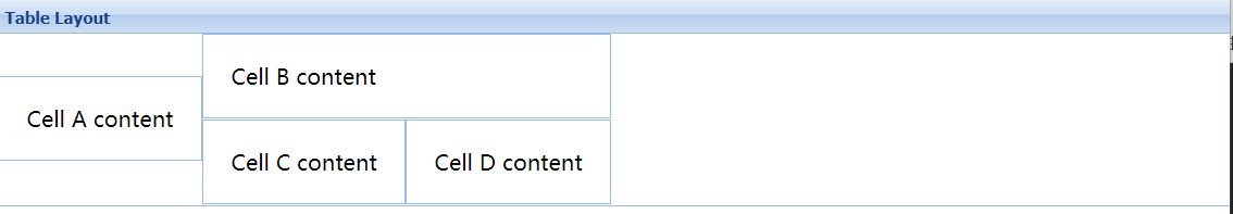
12、TableLayout 表格布局
继承于ContainerLayout,可轻松渲染一个表格。对应布局属性layout值为“table”。
关键组件属性:
-
rowspan 该项会在单元格上生效的rowspan。
-
colspan 该项会在单元格上生效的colspan。
-
cellId 该项会在单元格上生效的id。
-
cellCls 添加到表格单元格内的CSS样式名称。
测试代码:
var table = new Ext.Panel({
    renderTo: Ext.getBody(),
    title: 'Table Layout',
    layout: 'table',
    defaults: {
        // 对每一个子面板都有效
        bodyStyle: 'padding:20px'
    },
    layoutConfig: {
        // 这里指定总列数
        columns: 3
    },
    items: [{
        html: '<p>Cell A content</p>',
        rowspan: 2
    }, {
        html: '<p>Cell B content</p>',
        colspan: 2
    }, {
        html: '<p>Cell C content</p>',
        cellCls: 'highlight'
    }, {
        html: '<p>Cell D content</p>'
    }]
});
渲染效果:
13、MenuLayout 菜单布局
此布局继承于ContainerLayout,被用于Ext.menu.Menu 组件,通常不应直接使用,故不实践。
14、ToolbarLayout 工具栏布局
此布局继承于ContainerLayout,文档说明较少,基础实践发现类似横向盒子布局,但各组件紧密相连,此处不实践。
后记:
通过对各布局类型的实践,对ExtJS中布局有了个更好的掌握,也发现之前自己做的页面,部分布局是不合理的或者说并不是最佳实践,感到庆幸,改天及时调整。
再次强化自己对于学习方法上的看法,学技术,一定认准官方文档!